Designs that refuse to blend in
I design websites with personality, so businesses, charities, and organisations don’t look like everyone else.
- Abergele Dental
- Alessandro Mastroianni
- Animal Search
- Ansarada
- Begoña Pereda
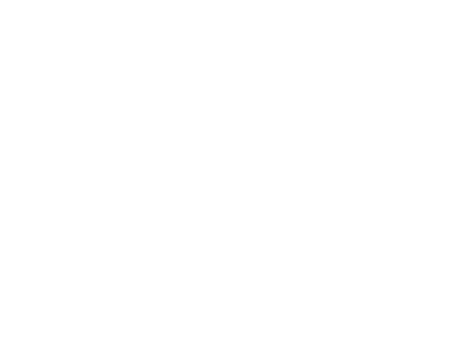
- Buskers Bern
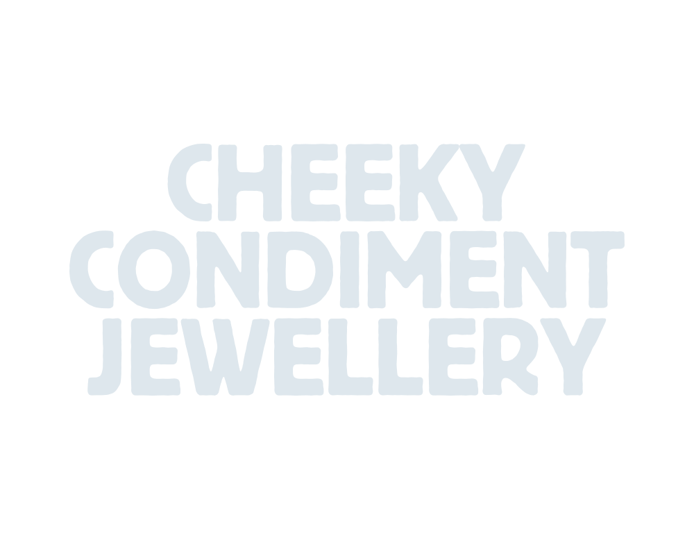
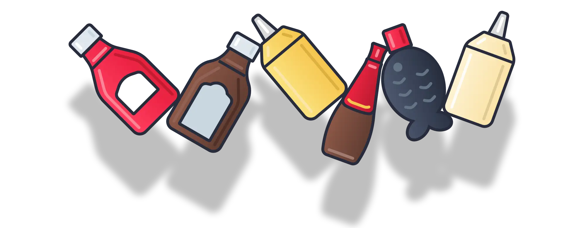
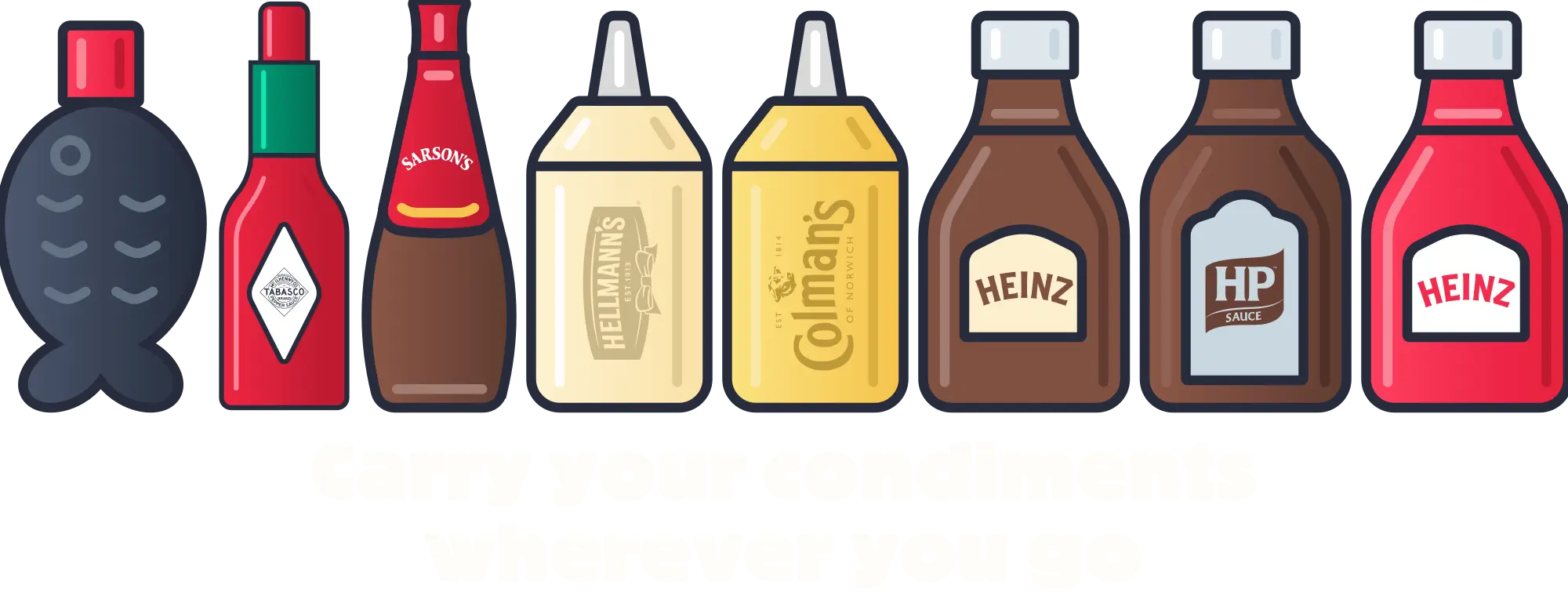
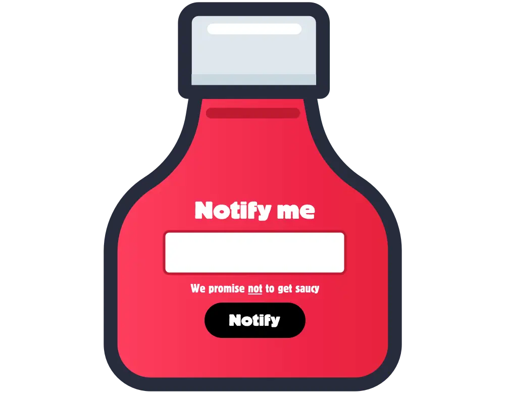
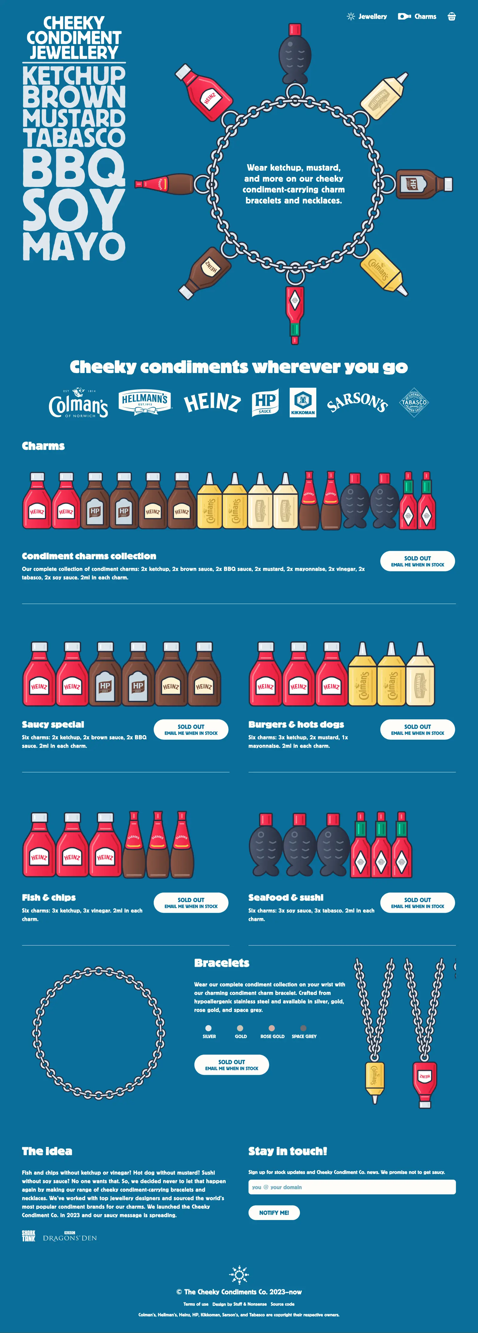
- Cheeky Condiment Jewellery (spoof)
- Codeboxx
- Compass Financial
- Count Binface
- Dementia Care
- Disney Store UK
- Emma Bodger
- Greenpeace Poland
- Llanasa Community Council
- Michael Baugh
- Mike Worth
- Neurodiverse Training
- Nozomi Networks
- NWPS Construction
- Open University
- Rebrand Britain (spoof)
- Reuven Herman
- SAP
- The Shared Homeland Paradigm
- SoFoot
- SunLife
- Tristan Jakob-Hoff
- WWF UK
- Zombie Hunt
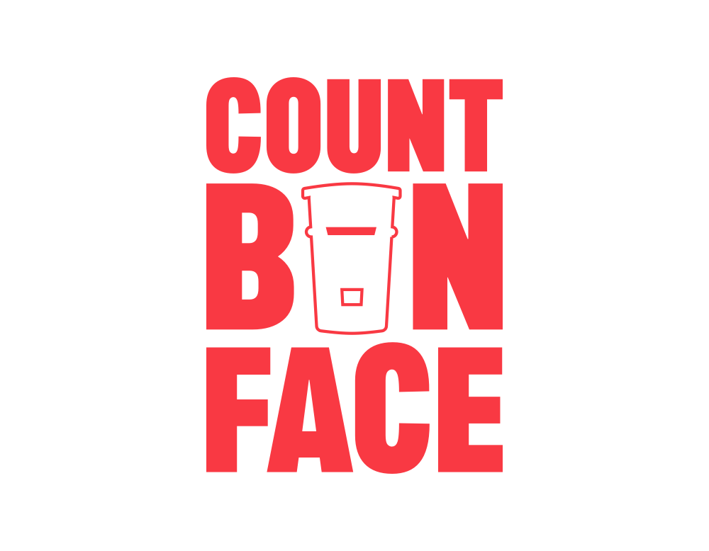
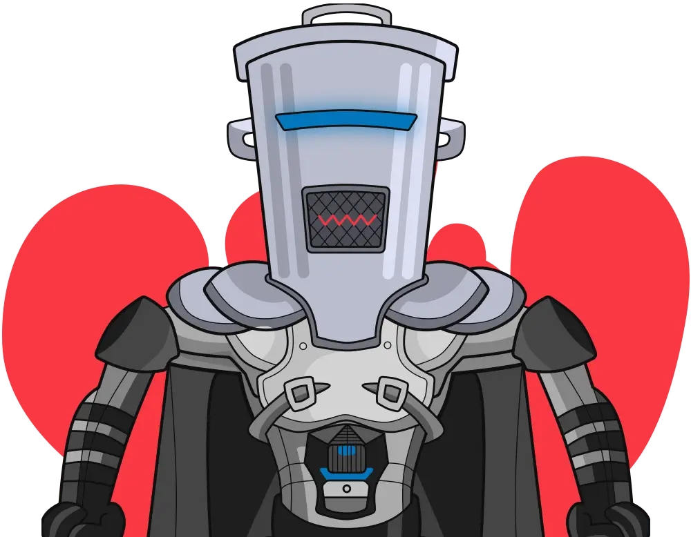
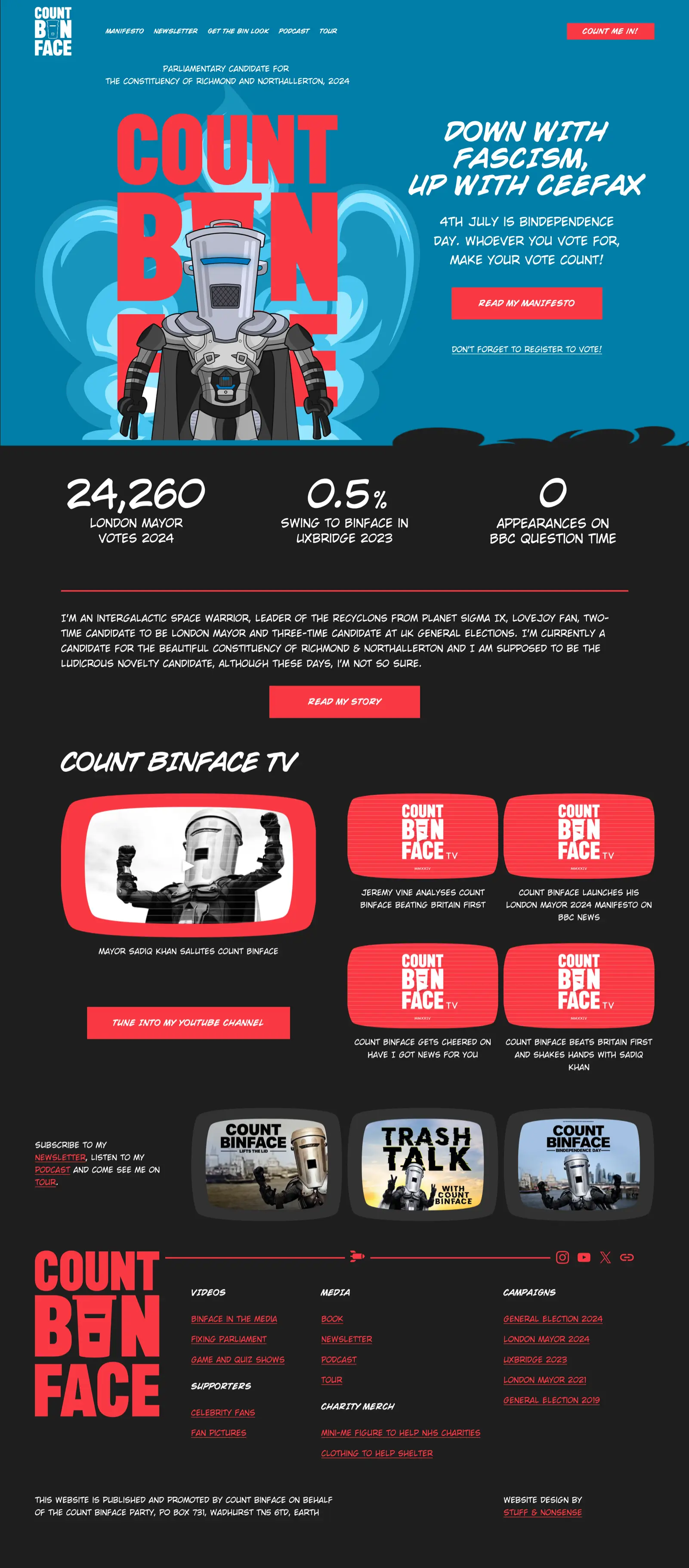
Count Binface.
Political campaign website for this satirical political candidate and intergalactic space warrior.
Andy”s reputation reached across the omniverse to my home planet. So, I commanded him to turn them into what humans call a “website” for my 2024 General Election campaign.
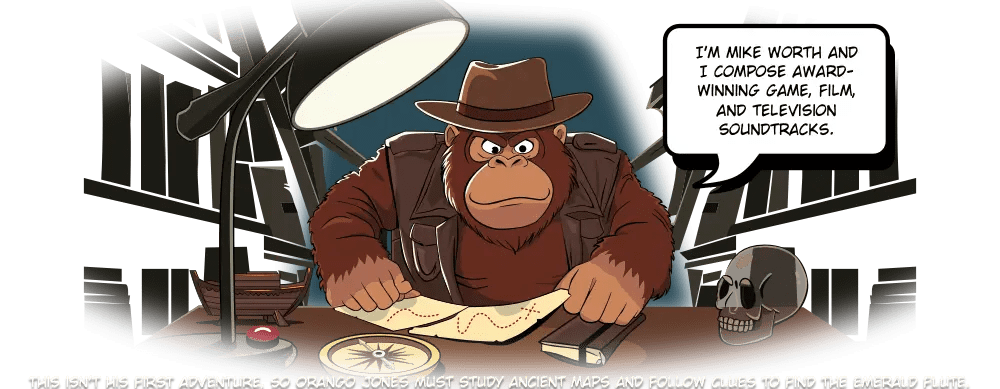
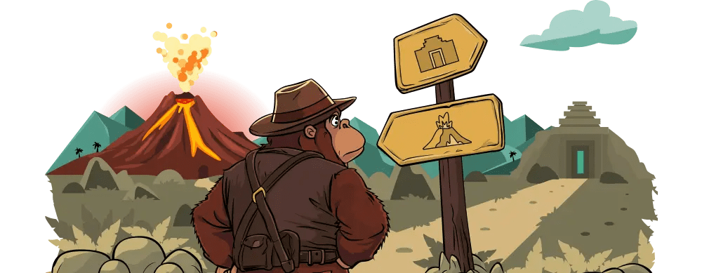
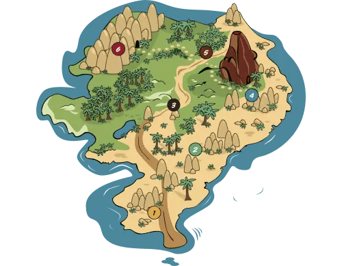
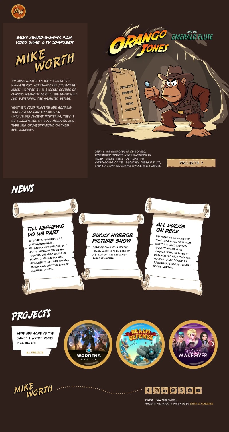
Mike Worth
Website design for an Emmy award-winning composer, combining SVG animation, character illustration, and a highly graphical, story-led approach.
Boom! God, it looks 100% AWESOME! Damn, it’s super light and very mobile friendly. Andy, my friend, you are ON POINT with this! Thank you!
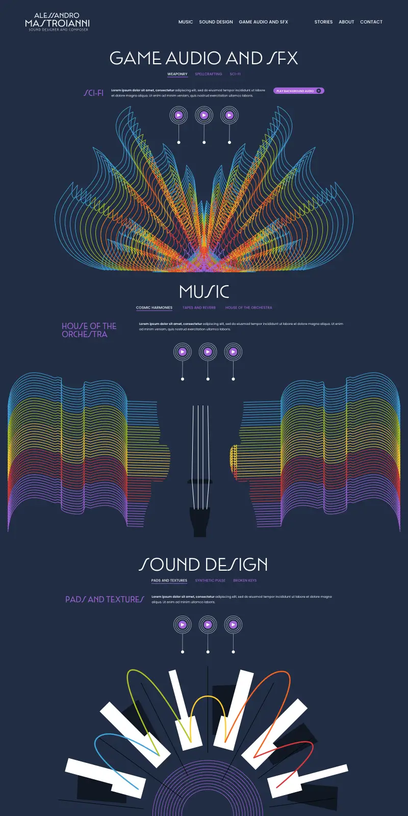
Alessandro Mastroianni. Sound designer
Portfolio website design combining expressive animation and graphic design.
I loved working with Andy. He not only brings his incredible talent to the table, he listens to your ideas and transforms them into a brand that really looks like you.
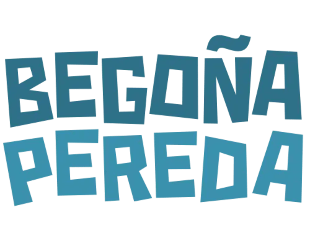
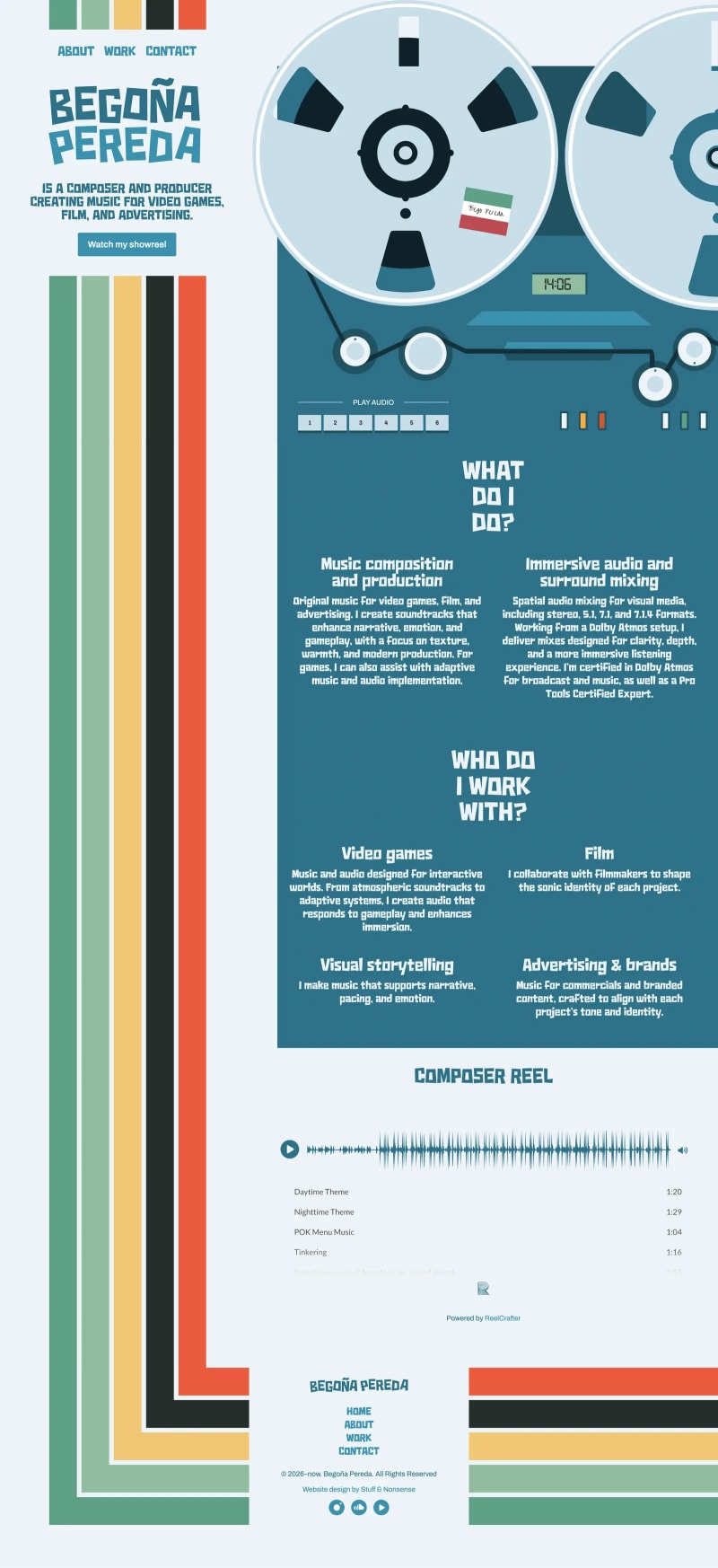
Begoña Pereda
Website design for a composer, combining editorial layout, typography, and expressive visual storytelling.
Andy exceeded my expectations. My website is now a true representation of who I am and what I do, while also being a fun and engaging space to explore.
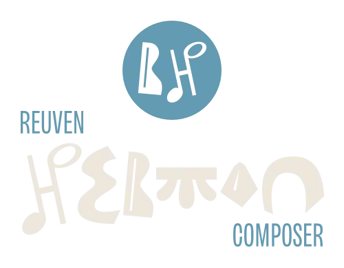
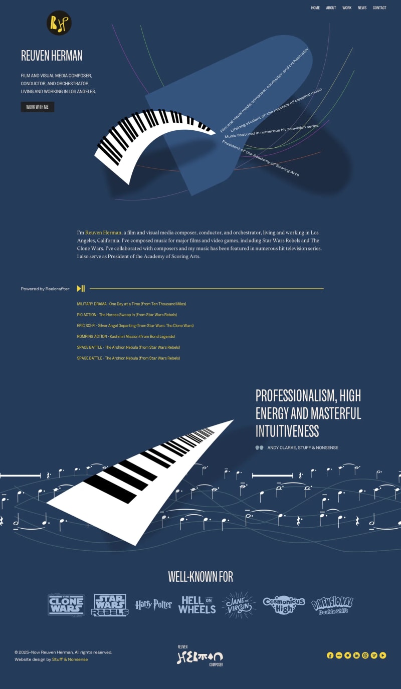
Reuven Herman
Portfolio website design combining expressive animation with editorial layout and typography.


Nozomi Networks. Vantage
Designing a brand new subscription-based product for this leader in cybersecurity.
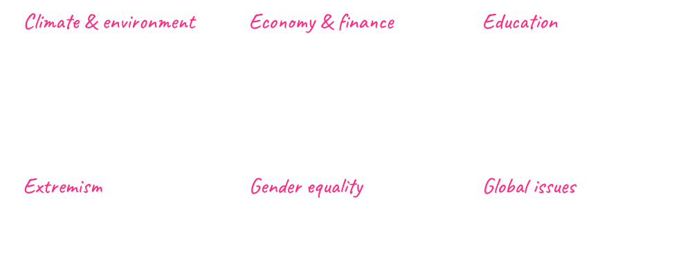
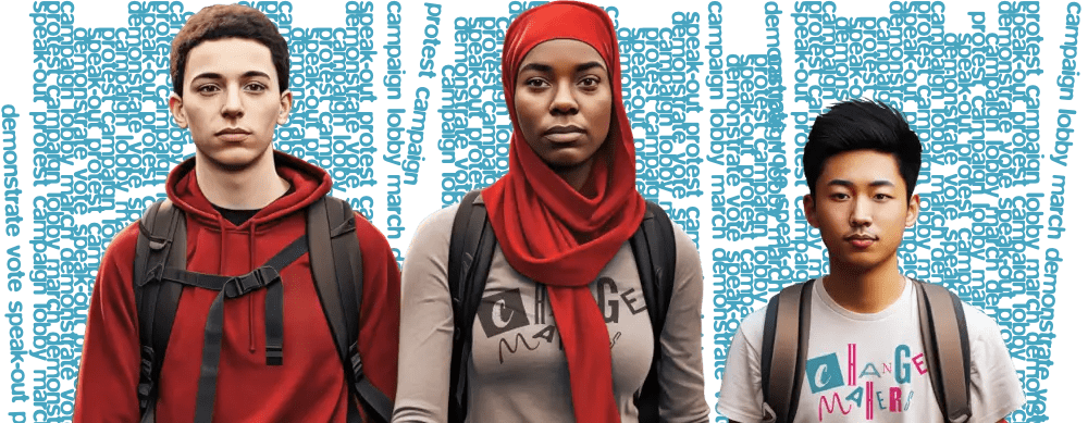
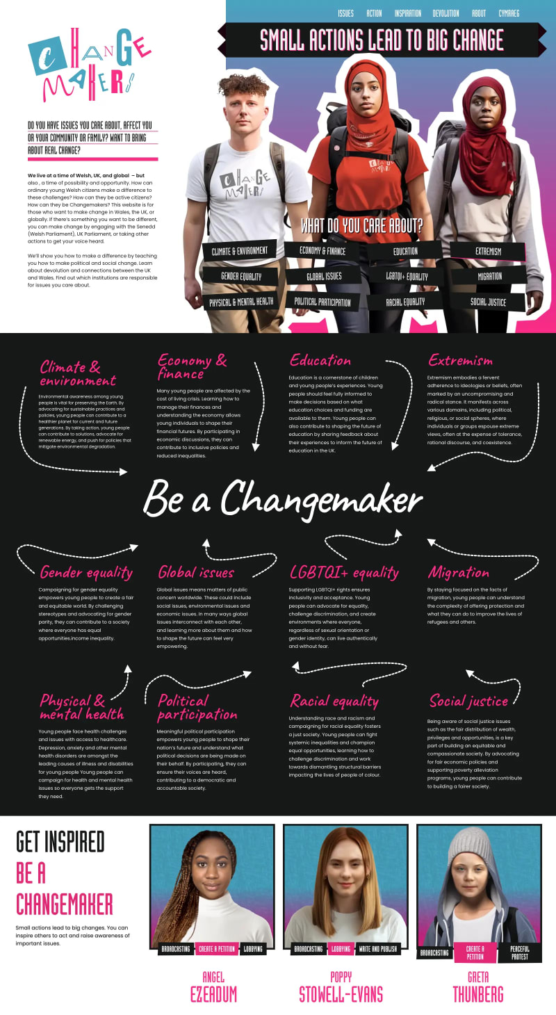
Open University: Changemakers
Website design using bold graphic elements, structured content, and typography to encourage young people to get involved in politics.
Andy is a bloomin’ creative genius, he really is! I massively appreciate not only his talent, but also his commitment to making this project a success.
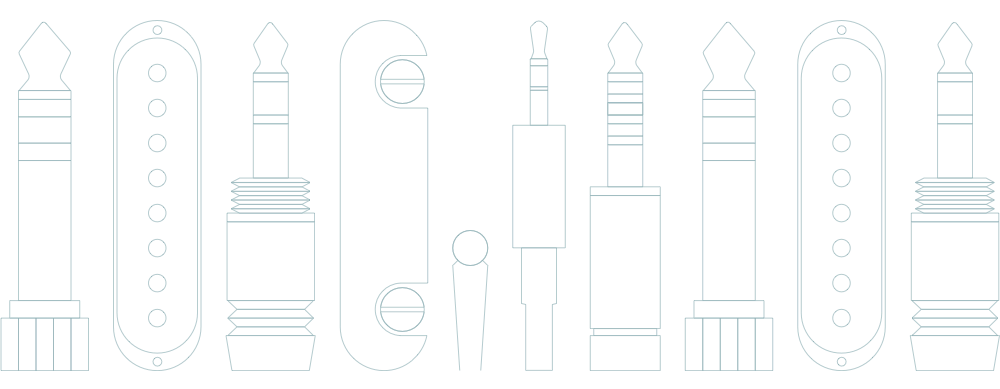
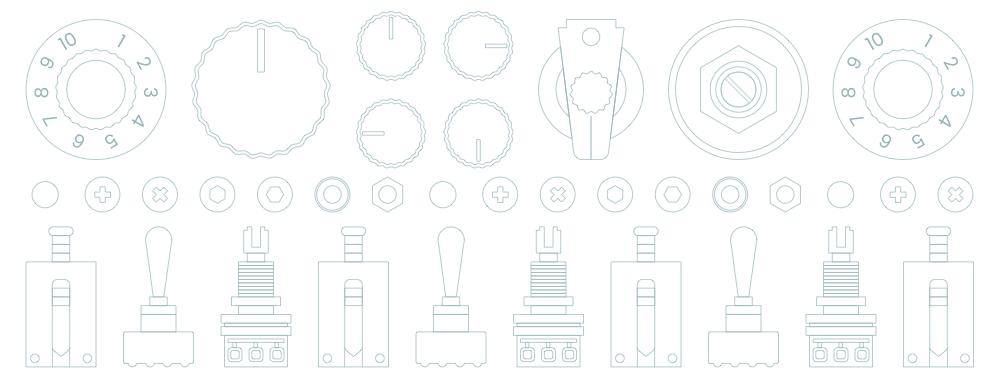
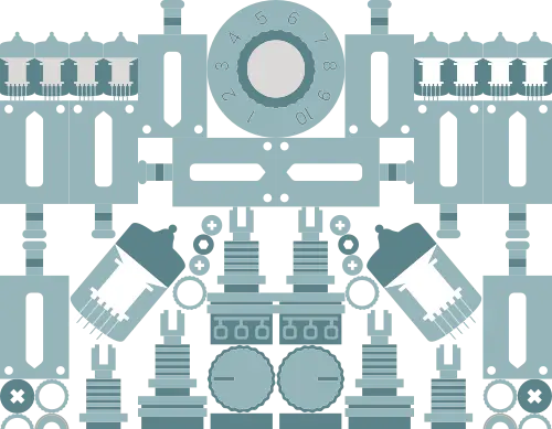
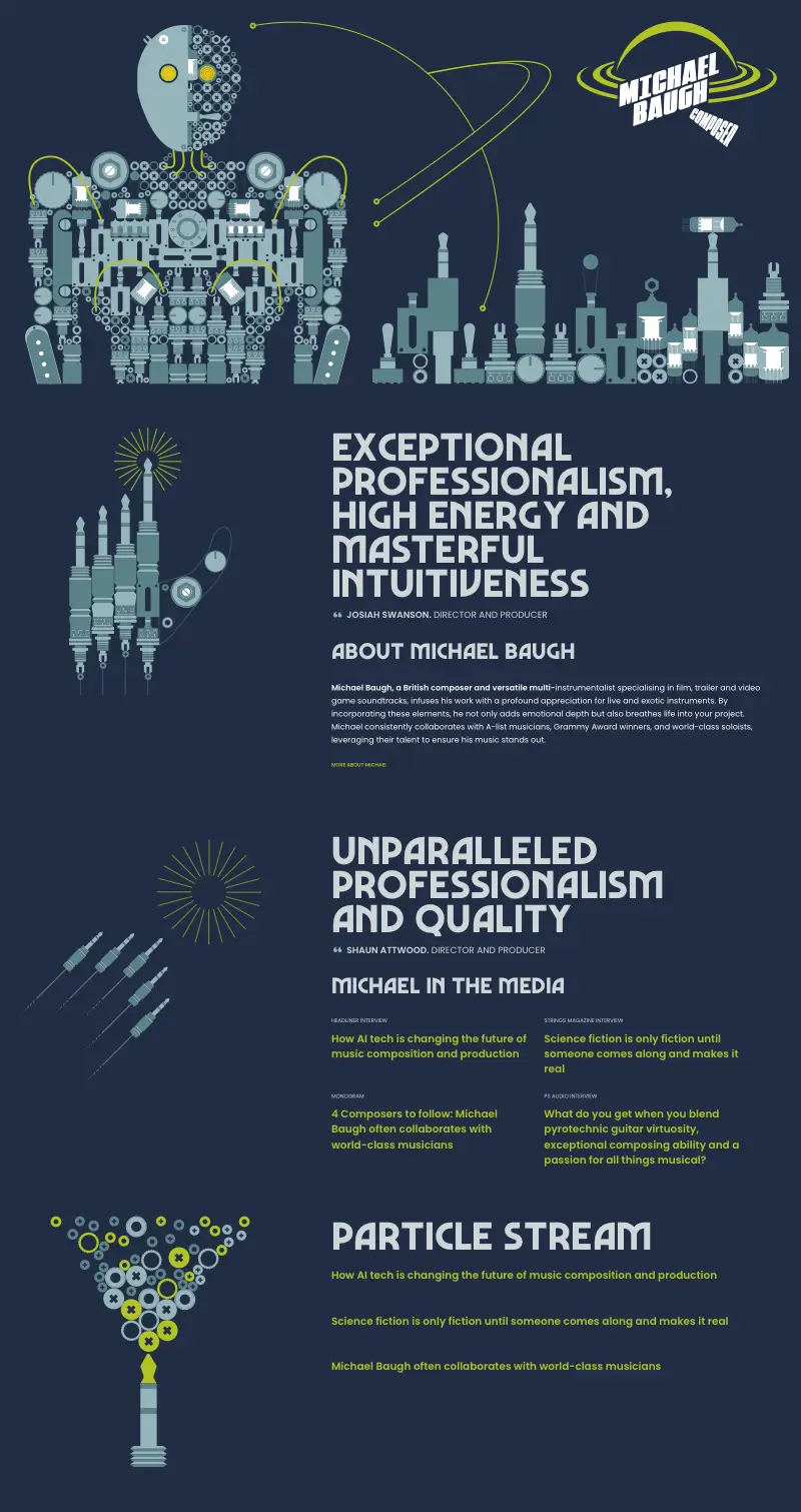
Michael Baugh. Composer
Portfolio website design combining expressive animation and graphic design.
I searched long and hard for a web designer to create something unique, that stands out, and is more than a website. Andy delivered precisely that. If you’re looking for attention to detail, collaboration, quality, seamless execution, and maximum creativity, look no further.
Neurodiverse Training
A website designed to help this training company reach a wider audience.
Andy worked with me every step, to my schedule, and he brought my ideas to life beautifully. He was an absolute pleasure to work with and is enthusiastic, composed, and cool.
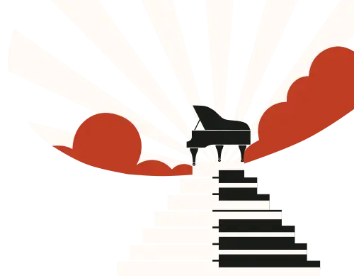
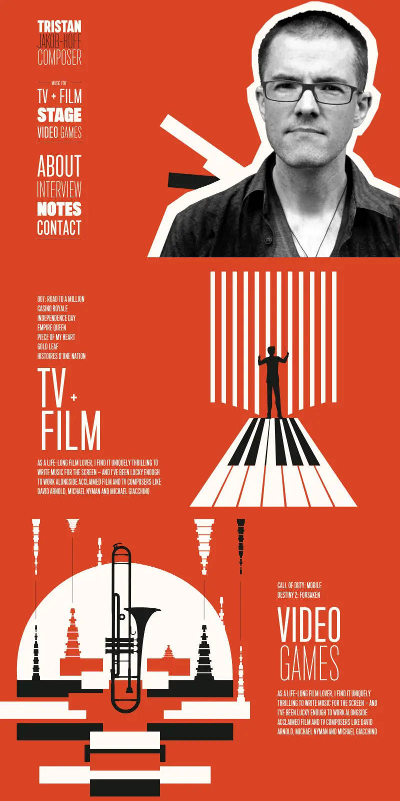
Tristan Jakob-Hoff. Composer
Portfolio website design combining expressive graphic and typographic design.
Andy is that rare combination of a designer who really knows his technical stuff and has an incredible gift for design. He’s the go-to person if you want a design which looks fresh and original. It was an absolute pleasure working with Andy and watching him pull from his imagination, things I could never have dreamed of.
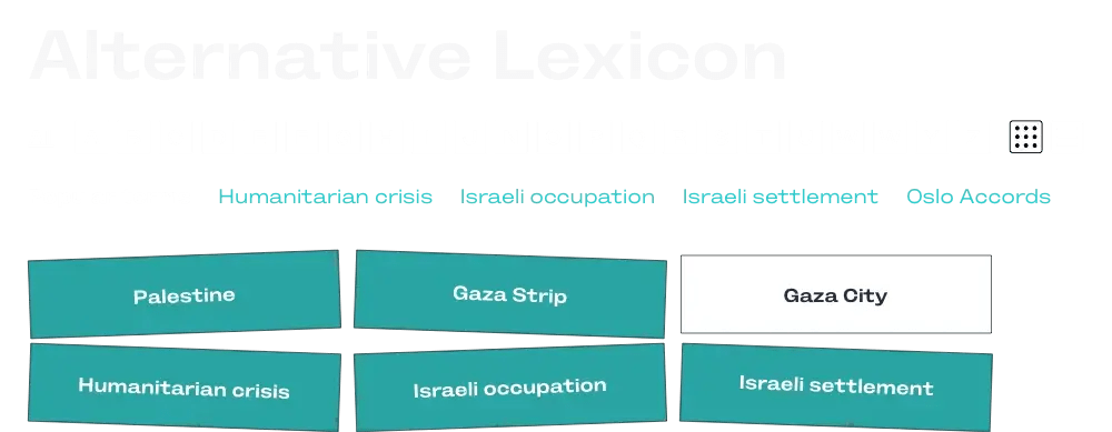
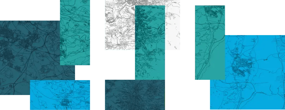
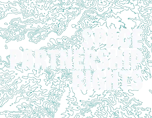
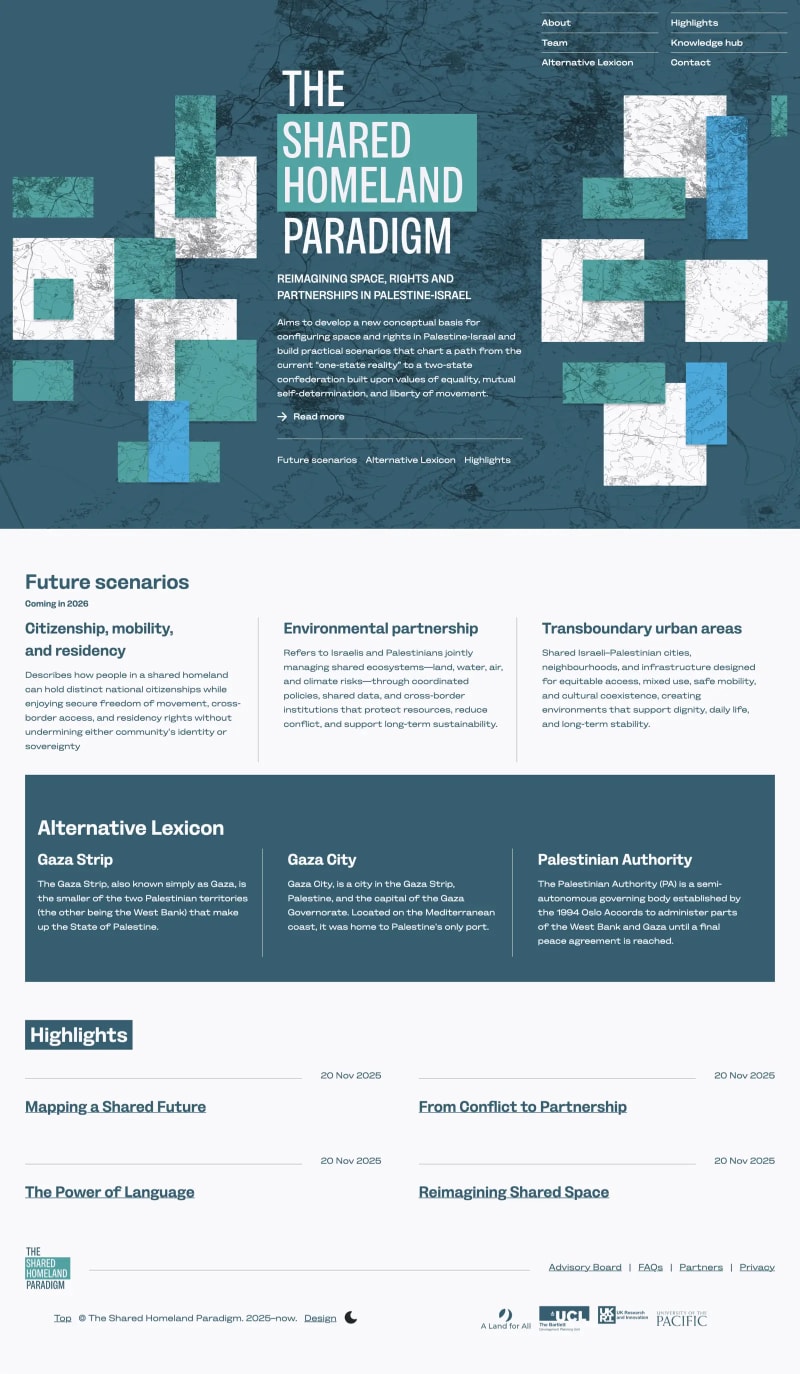
The Shared Homeland Paradigm
Website design for a cultural and political initiative, combining editorial layout, typography, and structured content to communicate complex ideas.
Andy exceeded every expectation. He didn’t just build us a website; he expertly guided our branding and design to ensure our project was presented in the best possible light. Professionally, he is top-tier.
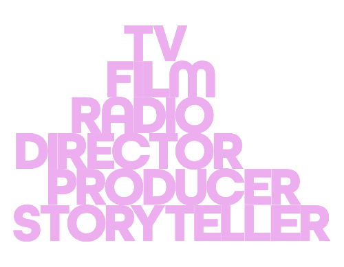
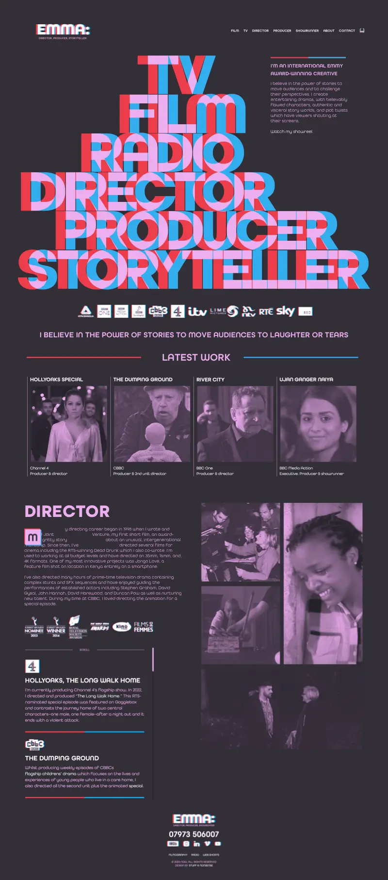
Emma Bodger. Film and TV director
A website design for film and TV director and producer Emma Bodger which showcases her creative talents.
I loved collaborating with Andy on my website. Not only are his design skills and tech know-how really impressive, he is also fun and challenging to spend time with. I would highly recommend him to anyone who genuinely wants to investigate their brand and draw people in through clever and functional design with a twist.
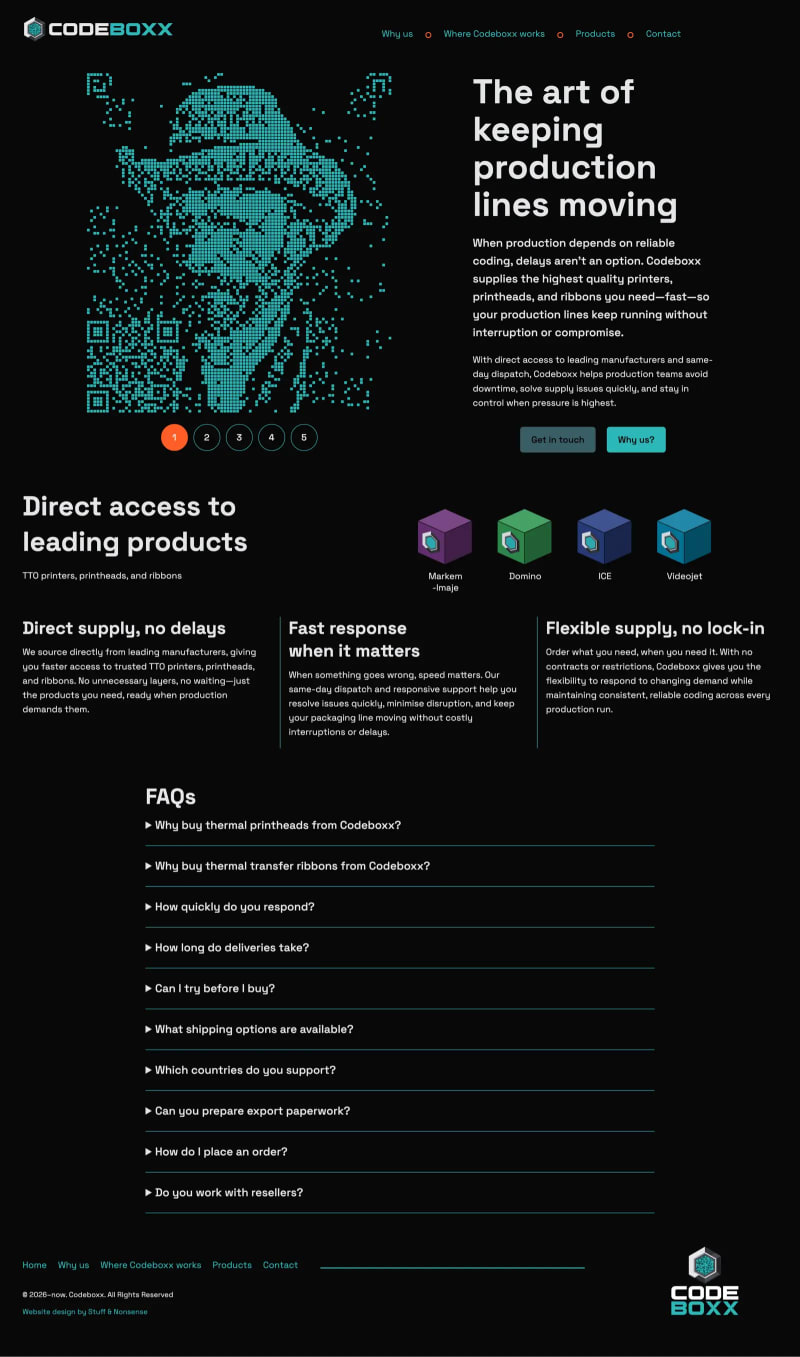
Codeboxx
Visual identity and website design with bespoke graphic illustrations.
Really pleased to have worked with Andy and to now stand out in our industry with a fresh and unique website. If you want something bold and different I highly would recommend Stuff & Nonsense.
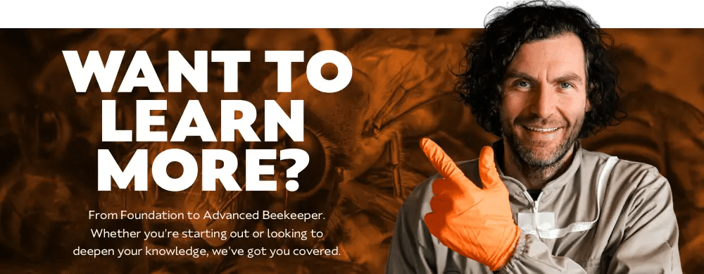
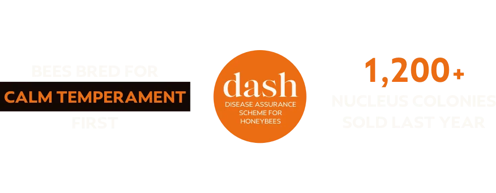
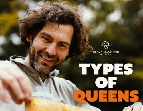
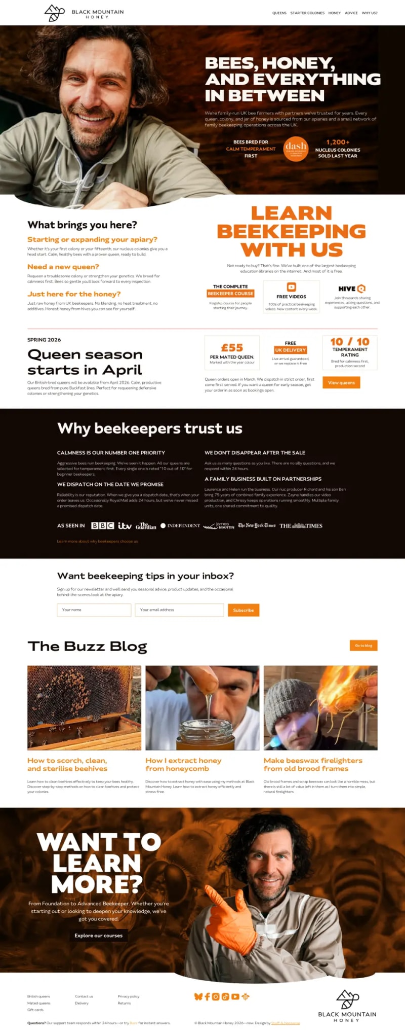
Black Mountain Honey
Creative direction, visual identity, and website redesign for the UK’s leading beekeeping company.
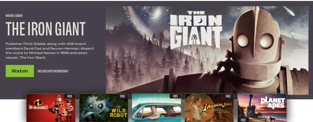
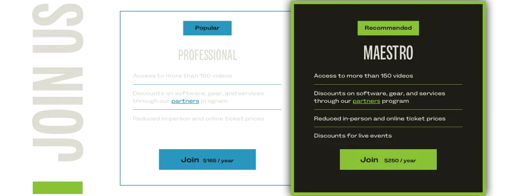
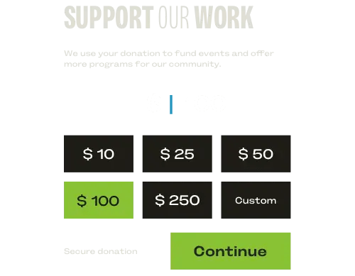
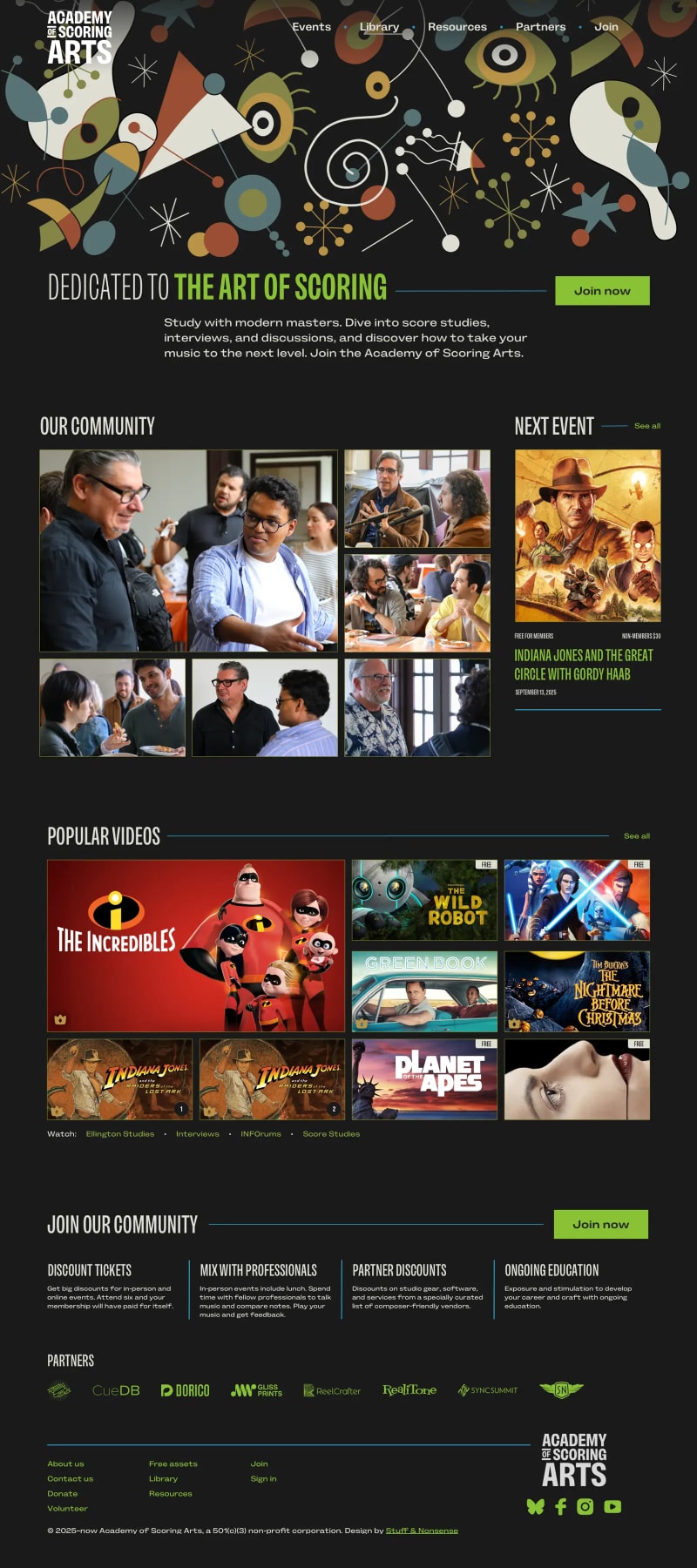
Academy of Scoring Arts
Website redesign for a music organisation, focused on content discovery, video-led learning, and increasing member sign-ups.
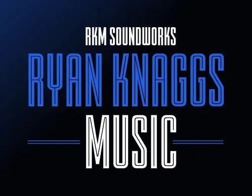
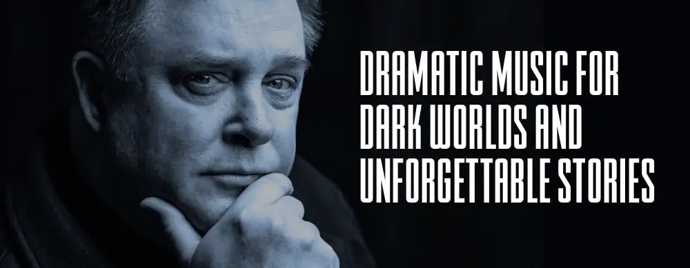
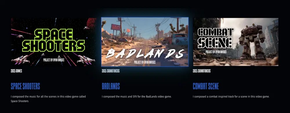
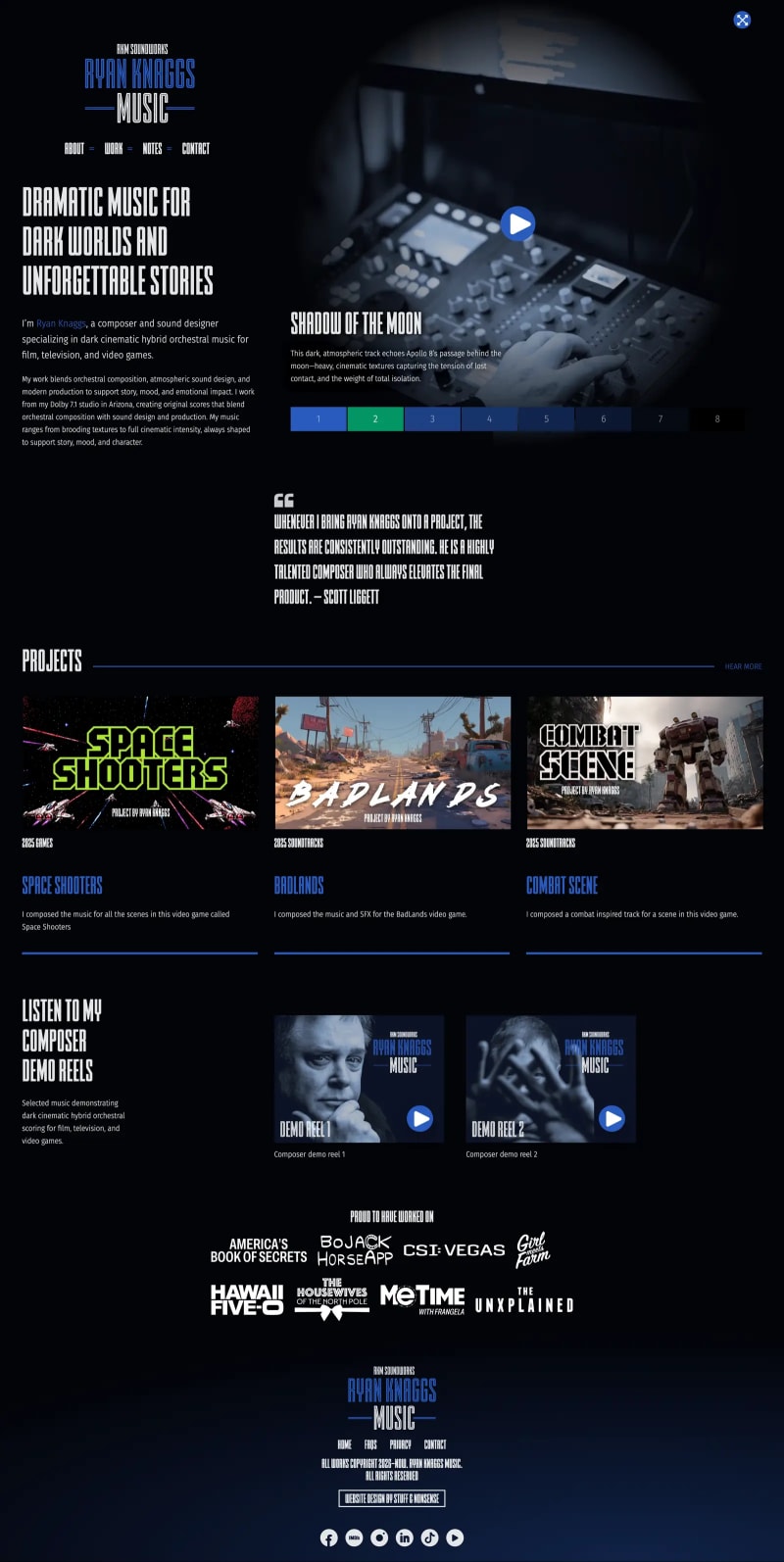
Ryan Knaggs
Portfolio website design combining editorial layout and typography design.
Working with Andy was an incredible experience. He translated my musical style into a brilliant, authentic brand. Feedback has been fantastic. Everyone mentions how the graphics and layout perfectly tell my story as a composer.
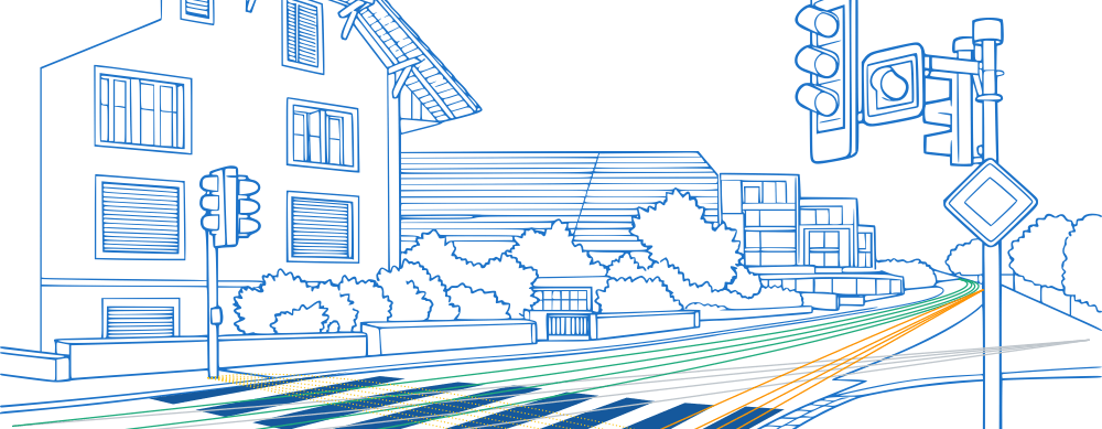
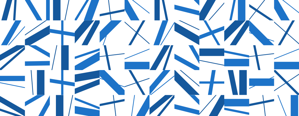
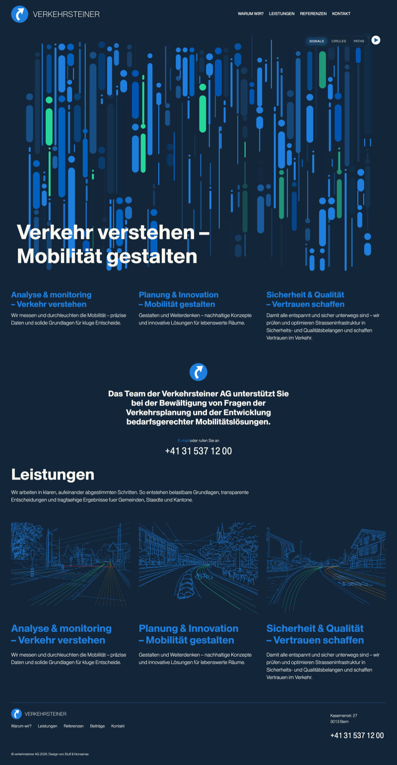
Verkehrsteiner
Visual identity and website design with bespoke graphic illustrations.
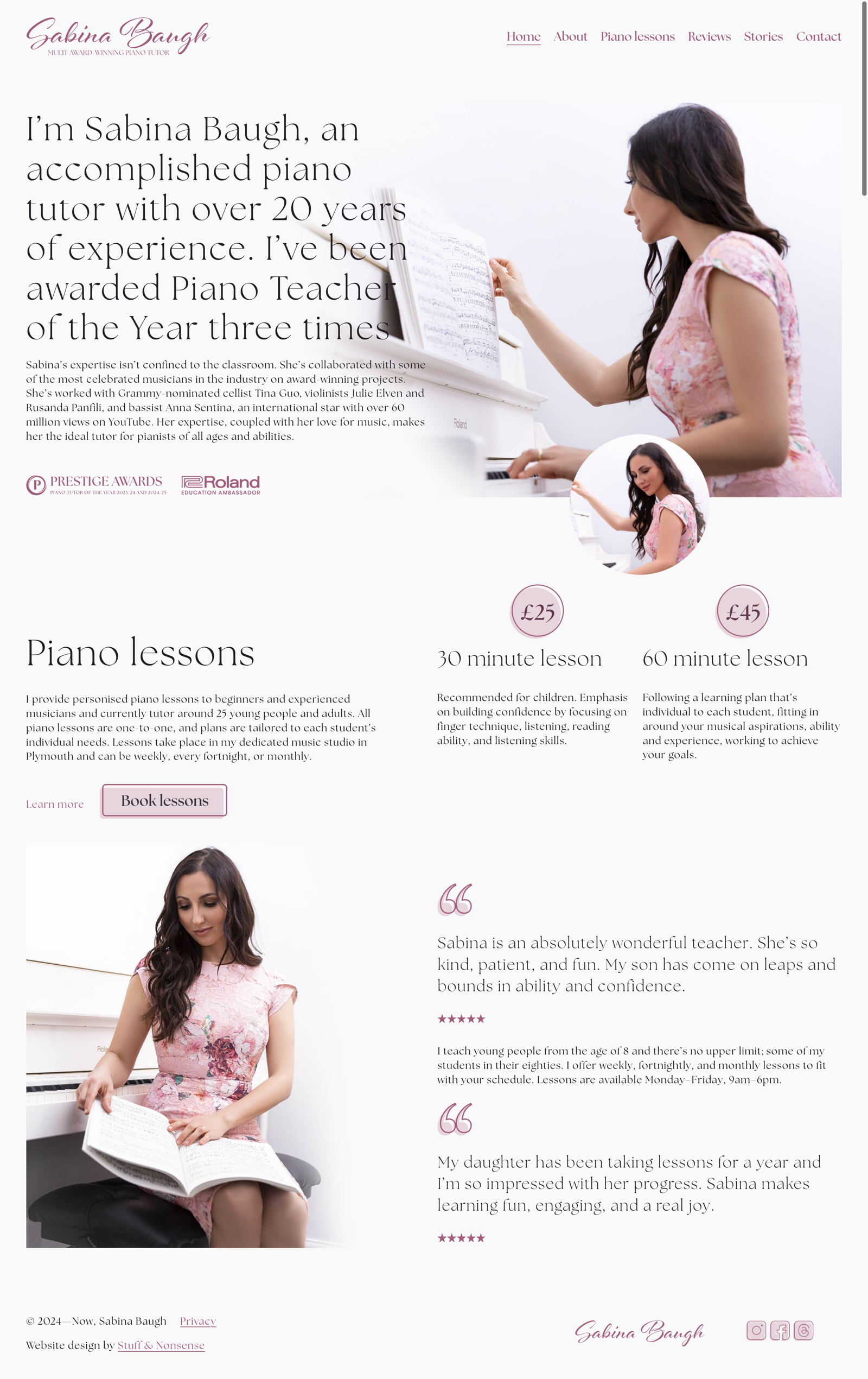
Sabina Baugh artwork. Multi-award-winning pianist

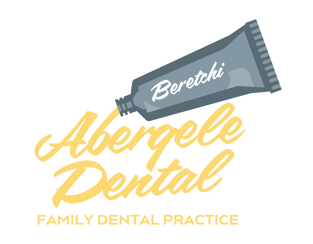
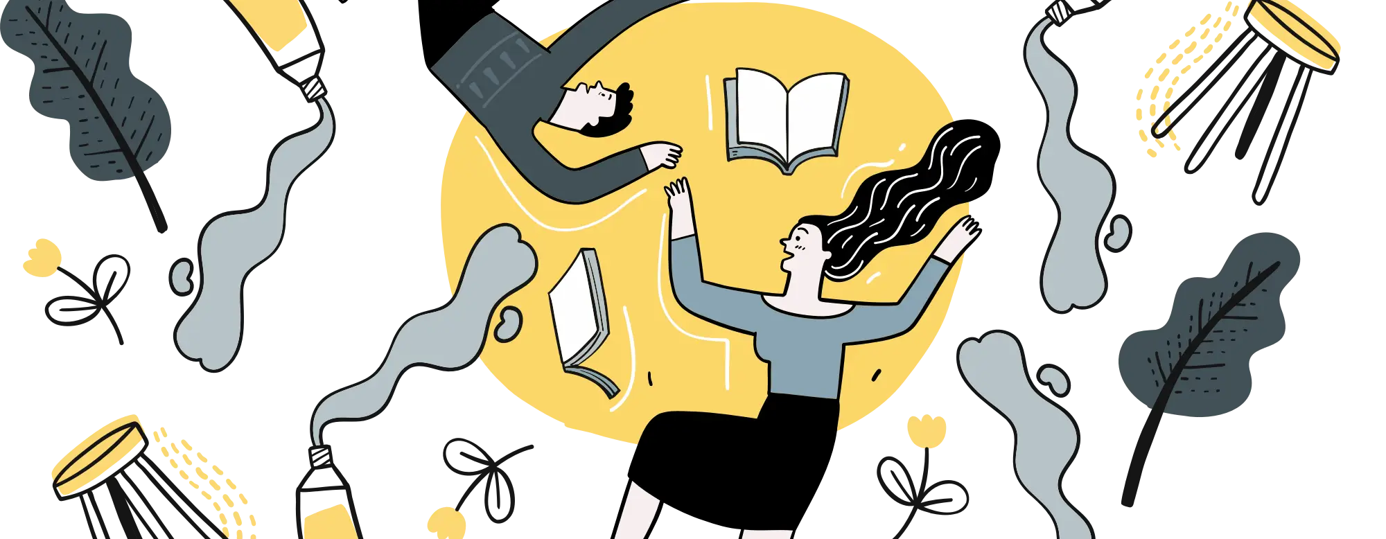
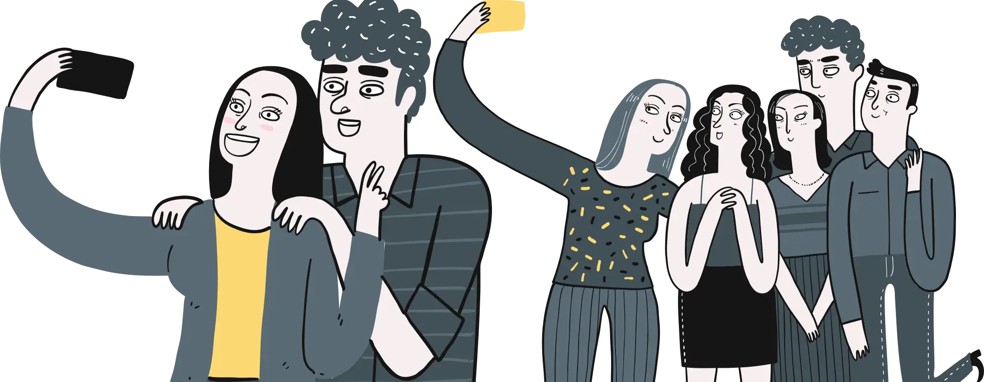
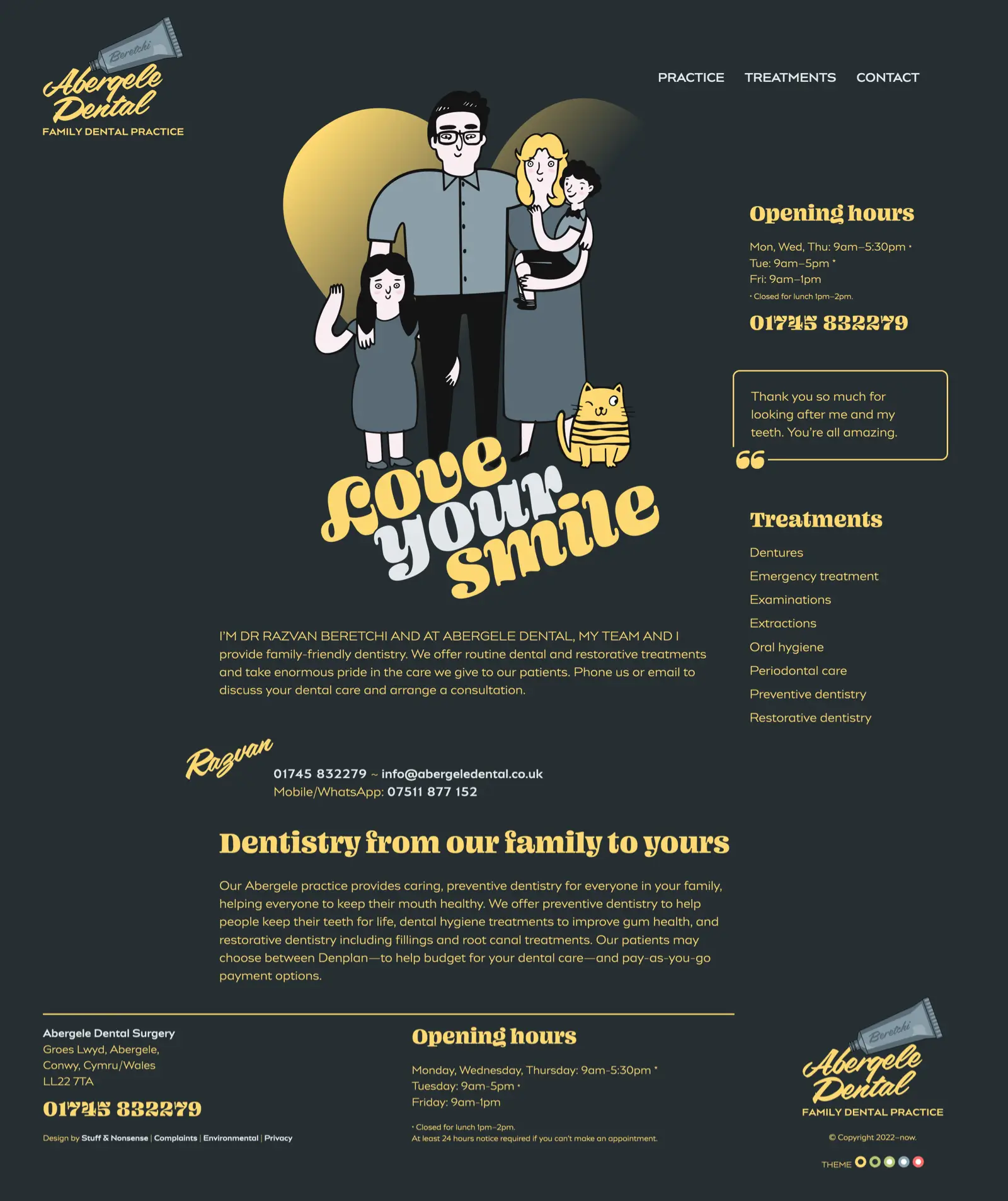
Abergele Dental