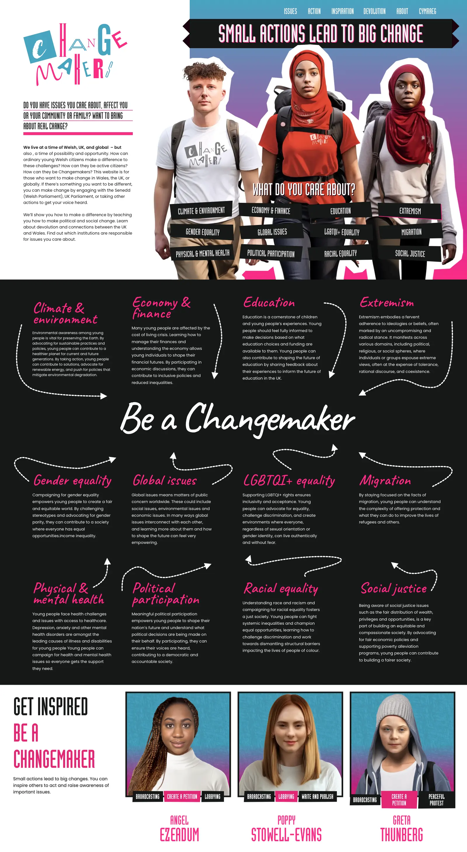
Branding, visual identity, and website design
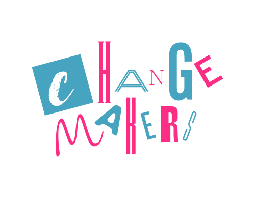
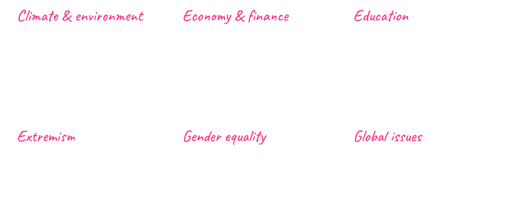
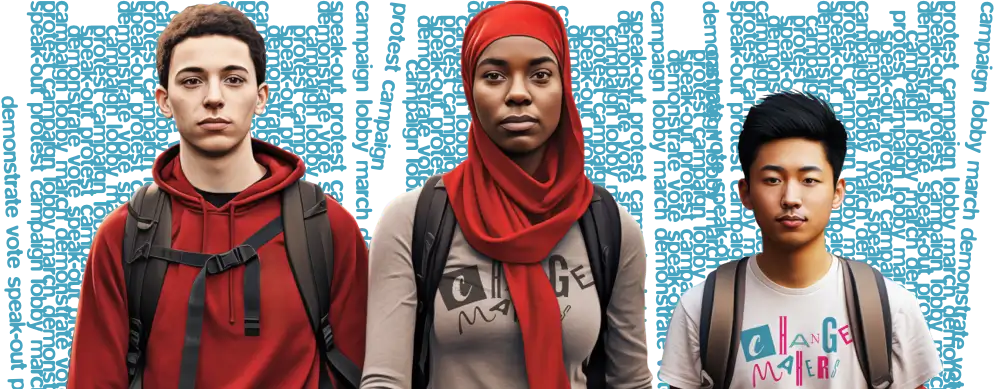
The Open University invited us to work on a design for their Changemakers project, which aims to get young Welsh people involved in the political process. My brief was to design a visual identity and a fully bilingual website that educates, informs, and inspires young people.
Andy is a bloomin’ creative genius, he really is! I massively appreciate not only his talent, but also his commitment to making this project a success.
Dr. Jenny Hewitt
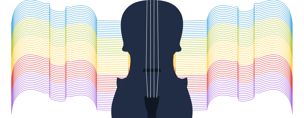
Branding, visual identity, and website design
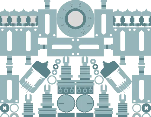
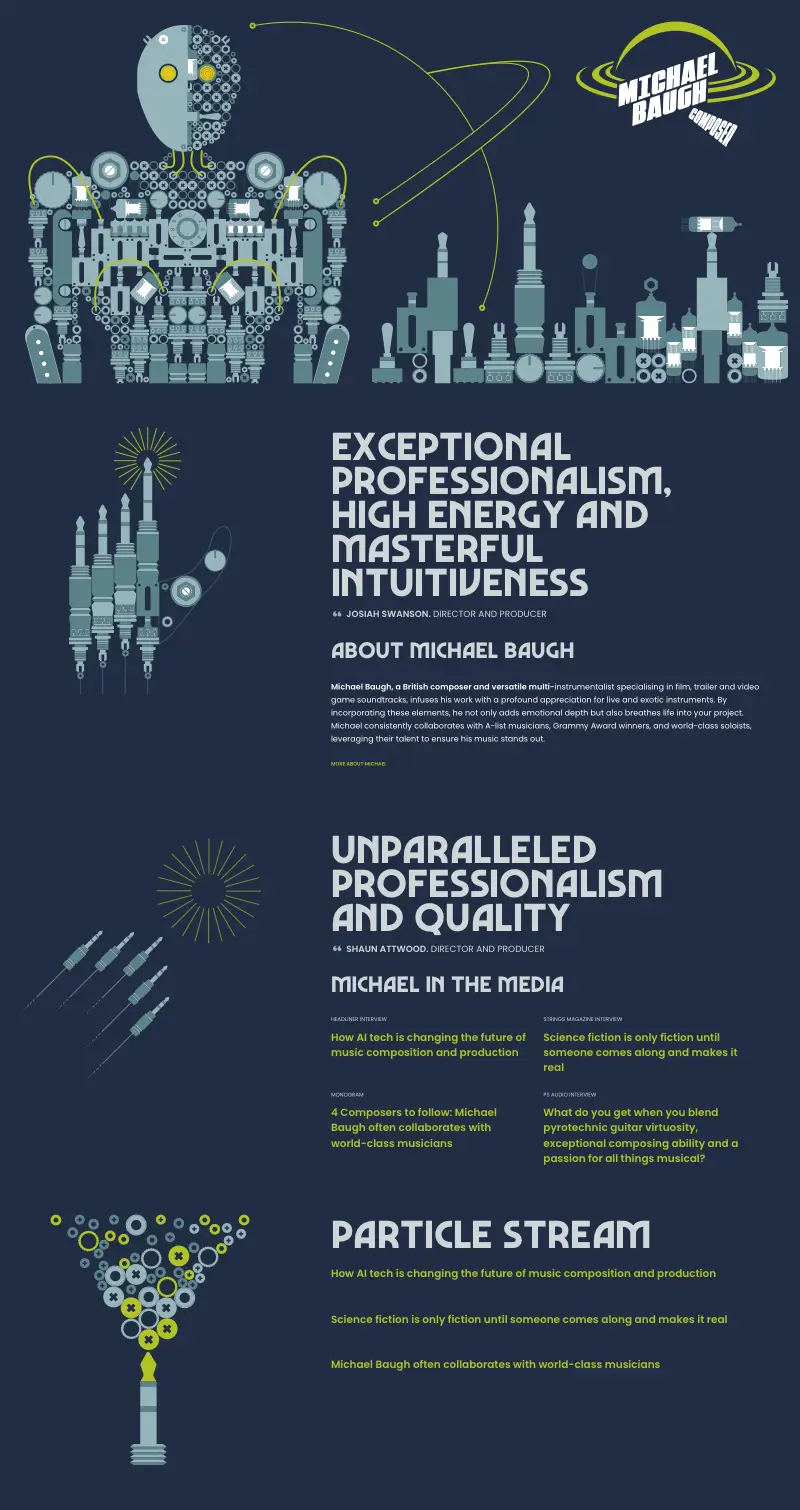
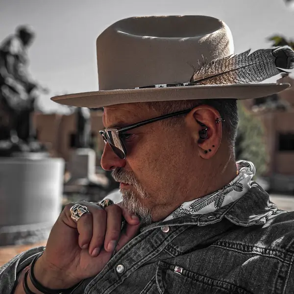
Michael Baugh is a British composer and multi-instrumentalist who works with some of the biggest names in music. He asked me to design and develop a new website that reflects his personality. So, I designed a new visual identity and created a bespoke series of original graphic illustrations with animations and integrated audio players. I developed a flexible website design and integrated a simple-to-use CMS for easy content editing.
I searched long and hard for a web designer to create something unique, that stands out, and is more than a website. Andy delivered precisely that. If you’re looking for attention to detail, collaboration, quality, seamless execution, and maximum creativity, look no further.
Michael Baugh
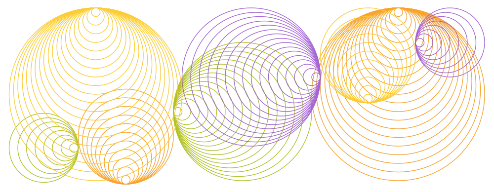
Branding, visual identity, and website design
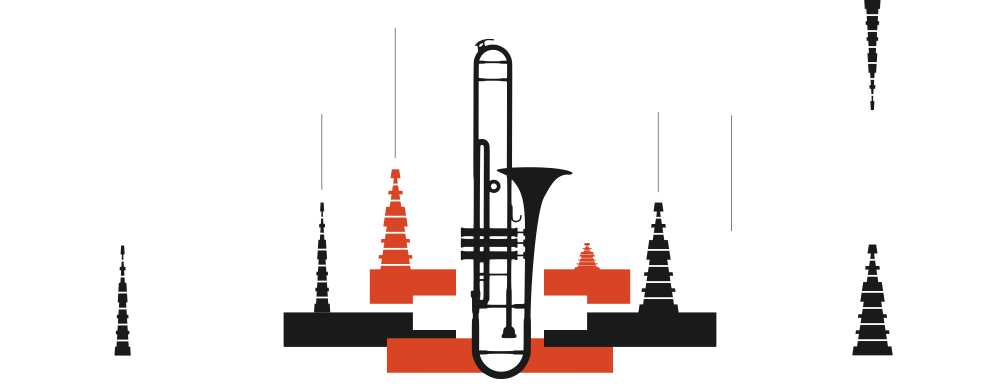
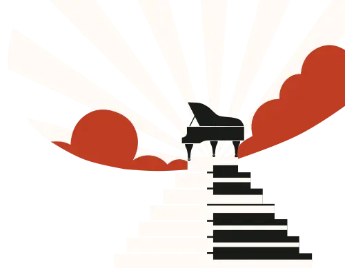
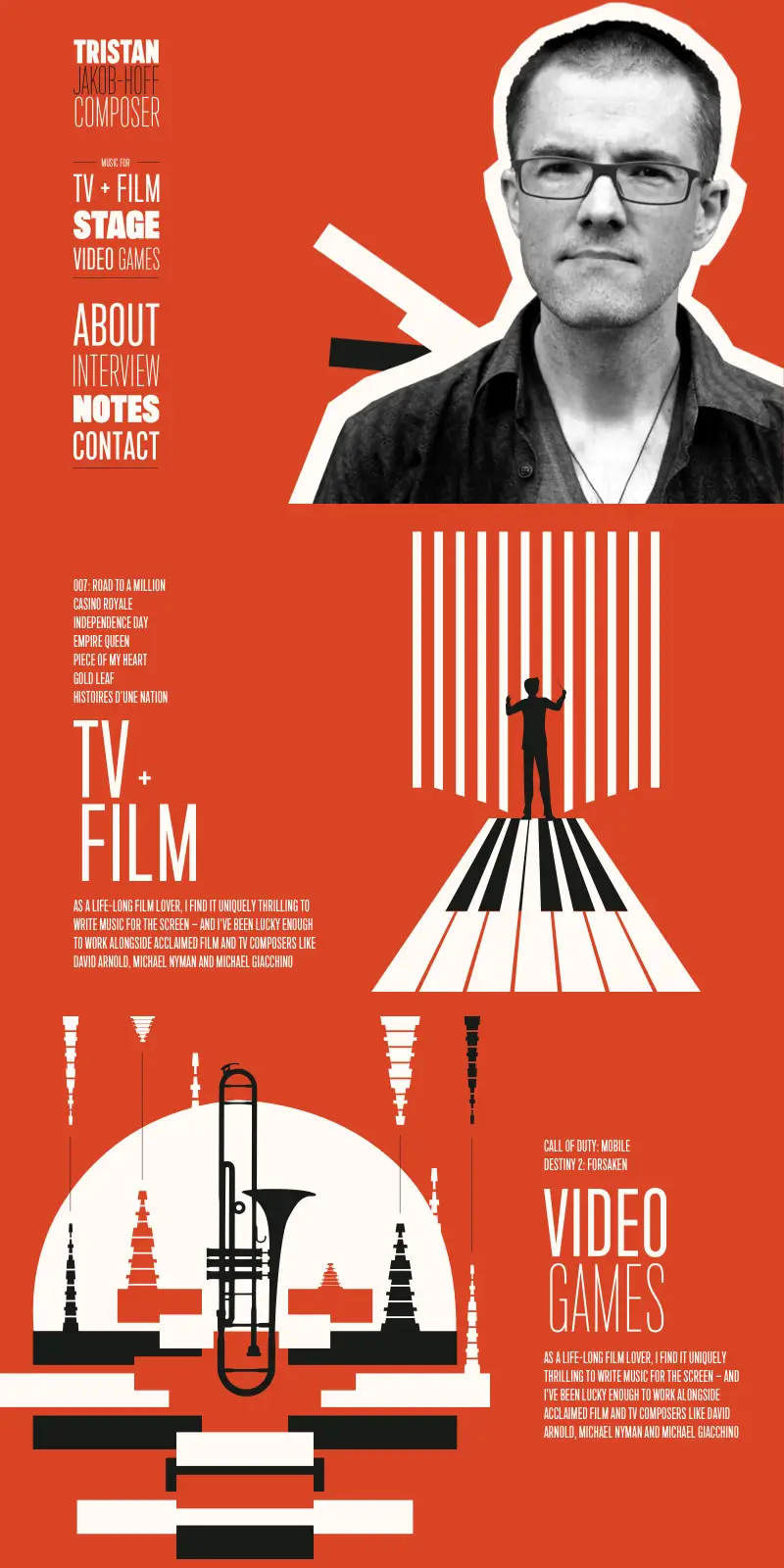
Tristan is a composer for television and film, the stage, and video games. He approached us to design and develop a new website that reflects his unique style. So, I designed a new visual identity with a distinctive colour palette and a bespoke series of original graphic illustrations. I developed a flexible website design and integrated a simple-to-use CMS for easy content editing.
Andy is that rare combination of a designer who really knows his technical stuff and has an incredible gift for design. He’s the go-to person if you want a design which looks fresh and original. It was an absolute pleasure working with Andy and watching him pull from his imagination, things I could never have dreamed of.
Tristan Jakob-Hoff
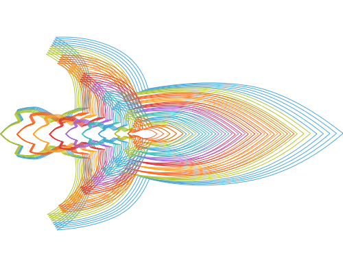
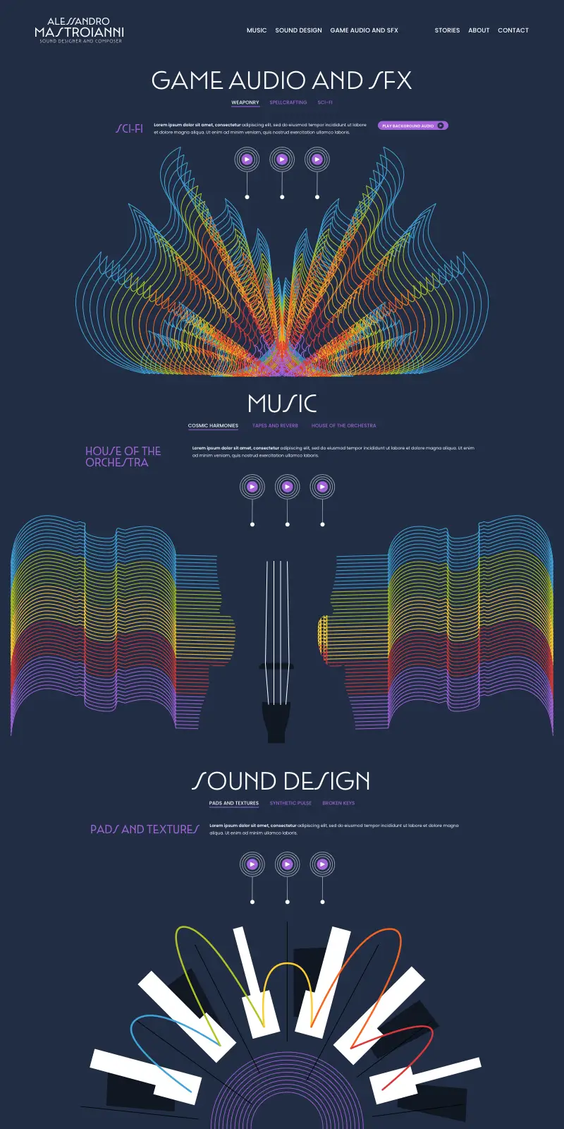
Branding, visual identity, and website design
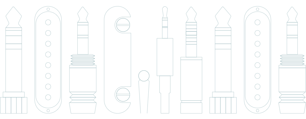
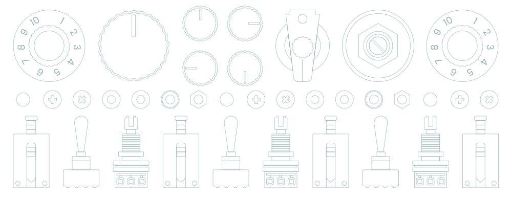
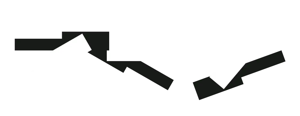
Alessandro is a sound designer specialising in video game audio and sound effects. He asked us to design and develop a new website with an obsessive level of detail to match his work. So, I designed a bespoke series of original graphic illustrations with animations and integrated audio players. I developed a flexible website design and integrated a simple-to-use CMS for easy content editing.
I loved working with Andy. He not only brings his incredible talent to the table, he listens to your ideas and transforms them into a brand that really looks like you.
Alessandro Mastroianni
 I’m a well-known designer and I’ve written