
WWF UK online store
In 2004—after eight weeks, 1,600 cups of coffee, 1,920 cigarettes, 16 pork sausages and one instant BBQ—I was pleased to announce the launch of a new online store for WWF UK. You can also read about my more recent redesign of their adoption and donation website.
Design evolution
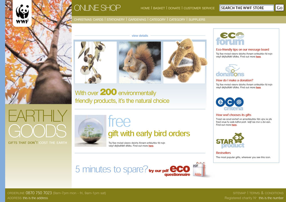
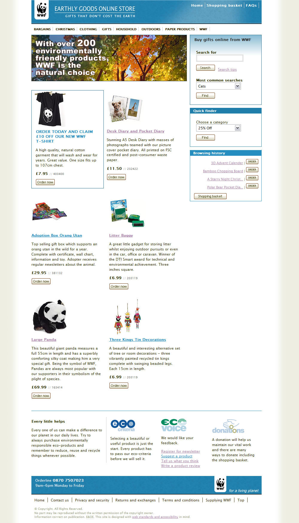
I was given a style guide along with some newly created icons that matched the printed mail order catalogue at the time. Key elements included a coloured band on the left of the page which related to the different sections of the printed catalogue, the tree image which featured on the catalogues cover and the placement of products and promotions.
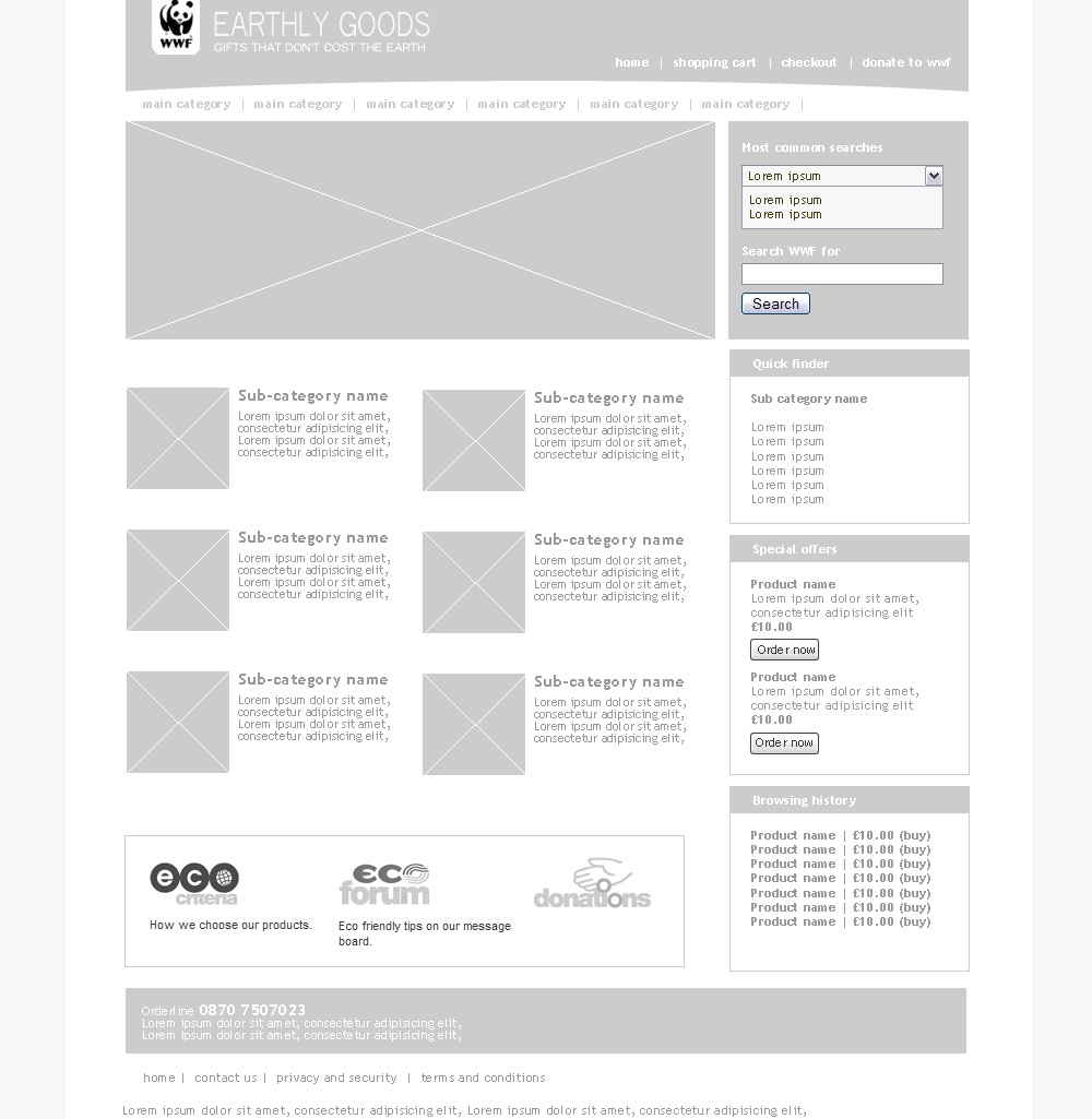
My first task was to create prototype layouts using a technique similar to Jason Santa Maria’s Grey Box Methodology. At this stage of the home page design, it was important to create space for functional elements including navigation, an expanded search area (which offers keyword searches and a drop-down menu of commonly used search phrases), palettes for recently viewed items, basket contents and incentive offers.
I also wanted to expand the space available for product information—providing product summaries, prices and buy now links—without losing the visual impact of the branding image, which I moved from the left into the centre of the screen.
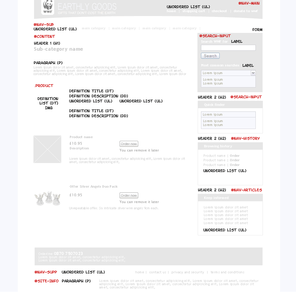
I marked up the grey boxes with tags I was likely to use, and the names of layout <div>s (marked in red). In this example of a category page, I decided to use definition lists to mark up product information. Using CSS made it possible to begin technical development and mark-up after grey box wireframes had been approved but before I completed final designs.
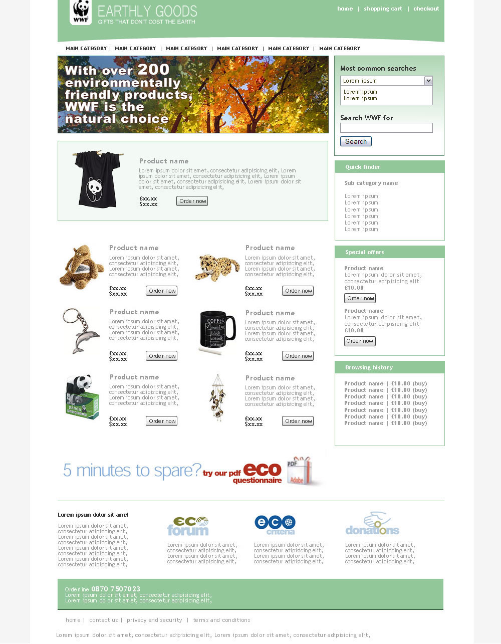
My next stage involved bringing colour to the grey boxes. To expand the range of colours and tones available, I made darker and lighter swatches using my favourite method and chose to replace the original coloured side panel with sections in different colours.
At this stage I added a curved bottom to the top of the pages (later removed) to hint at the curvature of the Earth and to soften the straight edges of the deesign. I also reduced the height of the branding area to allow for more product information above-the-fold.
With precise visuals and mark-up identical to the original plans, my next step was to work on CSS. The final pages remained faithful to the static visuals and although design revisions were made all the way to launch, they needed only changes to CSS and not the HTML.
It was very interesting to watch was how layouts reacted when including live product data, needing minor changes to the CSS to increase space available for longer product descriptions. All in all, my layouts held up well under the deluge of content and then a two-day final pass ironed out any remaining issues.
CSS layouts weren’t particularly newsworthy in certain sectors in 2004, but working with WWF—who embraced accessibility and standards because they wanted to, not because they had to), was a joy.
Thanks went to those kind souls who gave their time in Mac browsers and screen readers for testing.
Replies
-
#1 On August 5, 2004 01:48 PM Jonathan Snook said:
It’s posts like this that keep bringing me back to this site. :) The site is clean and fast. Well Done! Now I’ve got one question and one comment. Why is there a blue hover effect on the large image? (Firefox .9.2/Win) C: With the slightly redesigned products area, if you scroll down so all you see are products, it becomes more difficult to discern which product the price and “order now” buttons pertain to. I feel that some sort of separator between stacked products would help.
-
#2 On August 5, 2004 01:53 PM David Horn said:
The site is great, congratulations. Very slick. And, like many of your posts, I can see myself coming back to this one again and again. My only concern is that your cigarette:coffee ratio is a shockingly low 1.2. You’re clearly either not smoking enough or drinking too much coffee to disguise it. You should be aiming for 1.8 - 2.1, something like that. Better luck next time, at least the site was worth it. Well done!
-
#3 On August 5, 2004 03:24 PM Derek Featherstone said:
Nothing I haven’t said before, but here it is anyway. Brilliant work, Andy.
In addition to the site being a really nice piece of work with great design and functionality, you have gone above and beyond by exposing your methods, techniques, technology, decision making process and more to us. These real-world posts, with the kind of detail you are providing on some of your projects help everyone. Congrats mate.
-
#4 On August 5, 2004 03:57 PM Carlos Porto said:
Absolutely amazing! Talk about synergy. It’s great to see three different groups come together and produce such a nice site. Also, I noticed somebody has been reading defensive driving! The fact that your mentioning the use of XSLT, really makes me think I should start to read and learn more about it. Thanks for the great share! Great work!
-
#5 On August 6, 2004 10:14 AM Phunky said:
XSLT is great! Really powerful and a great tool when used in the right place. Just gonna go have a browser around the store and see how it runs :)
-
#6 On August 6, 2004 10:37 AM Jim Amos said:
Curious. I’m not seeing the history palette anywhere on the site (PC Firefox 0.9)
-
#7 On August 6, 2004 10:44 AM Malarkey said:
@ Jim: The history palette kicks into action when you visit an item’s detail page.
-
#8 On August 6, 2004 12:02 PM [Luc] said:
Excellent work, although I do agree that the products could do with some kind of separation. It kinda all flows into one in the middle.
-
#9 On August 6, 2004 12:43 PM Jeremy Freeman said:
You’ve done an amazing job with this Andy. It’s atheistically pleasing, clean, crisp and so user friendly. From an accessibility point of view, I’m interested to see what kind of feedback you get from the interesting accessibility statement that you came up with. Is it really impossible to design for all?
-
#10 On August 6, 2004 04:25 PM Tim said:
I think you’ve done a great job, but in the end looks like every other CSS/XHTML site out there, which I suspect might be symptomatic of the technology riding roughshod over the appearance. How else do you explain such a massive disparity between the original concept and what you ended up with?
-
#11 On August 7, 2004 07:46 AM Dave S. said:
“How else do you explain such a massive disparity between the original concept and what you ended up with?”
Pretty easily, I’d imagine. There are obviously very few visual elements from the original that were retained to the end; only Andy can say for sure, but I suspect that’s indicative of a flexible design process. Very rarely will a final site ever look like the original mockups. In fact, it’s so often NOT the case that anything is retained from the original drafts that I find the question a little naive. Sure, some elements may have been influenced by coding concerns, but then, some print jobs are influenced by the number of inks available within the budget. It’s just the nature of the job that aesthetics are influenced by technical concerns.
-
#12 On August 9, 2004 02:29 AM Andrew Krespanis said:
Another beautiful site, Comrade Andy. Although I must ask, what does a panda have to do with the World Wrestling Federation? :p
-
#13 On August 9, 2004 09:39 AM Phunky said:
It’s WWE now anyway :P due to them wanting WWF.com
-
#14 On August 10, 2004 05:12 PM Andy Budd said:
Good work Andy, and thanks for sharing your process with us. The grey box idea is an interesting one. It’s sort of halfway between a wireframe and a final design. I find one benefit of wireframes is that they remove the design aspect from the mix so the client can focus on content and interactivity. My concern with the grey box idea is that it could muddy the waters slightly.
Did your clients get the concept? It doesn’t look as though the design changed much between this phase and the final roll out, so I’m assuming they did. I’m quite interested in how different the grey box design was from the initial concept you were given. Often web design companies are handed concepts from creative agencies with little or no experience of the web and told to just build it. These will often have been approved by the end client before the web design team are even bought into the project.
In the case of the WWF were the concepts literally just guidelines, or did you have to convince the creative agency or end client that you guys should produce the final design?
-
#15 On August 10, 2004 05:52 PM Malarkey said:
@ Mr. Budd: Interestingly, the client was very keen on the grey box concept, and if we could have had more time, we would have performed user testing at that point :( The grey boxes and the final result DO differ from the supplied (a point made by Tim above). The point (not made well enough by me in the original post) is that the supplied concepts were little more than a variation of the catalogue designs. They contained very little of the navigation needed on an e-commerce site,
I did make a CSS mock-up of this comp, but the decision was made to take only the spirit of the comps and allow the content/navigation to dictate the layout. The other big change was in the colouring. We began by using the mustard colours from the comp (and shades of,) but later in the process it was decided to opt for the stronger colours of the WWF palette. Overall, the visuals—minimal I agree—grew organically throughout the project and were governed by functionality and content, rather than an imposed design.
-
#16 On August 10, 2004 11:54 PM johnny said:
I likes big booties. -
#17 On August 11, 2004 02:27 PM Rob Reed said:
Great work Andy. One thing I couldn’t find is a link back to the WWF info site. (I know it’s a well known URL, but someone may want to just read about Pandas without actually buying one.) Thanks for the write-up.
-
#18 On August 11, 2004 10:52 PM Phunky said:
You’ve been listed on cssbeauty.com for this now too.