
A very British art
It was announced yesterday that one of the most influential artists of the British 1960’s art movement, Patrick Caulfied, died on Thursday. Tate galleries director Nicholas Serota described Patrick Caulfield as one of the most original image makers in a talented generation of British artists. His still lifes and interiors captured mood and decor with incisive style.
.
While widely associated with British pop art, Caulfied consistently argued that the term pop art was inappropriate for his work. As the Times newspaper wrote,
Caulfield preferred to treat outworn Romantic themes rather than applying himself to the signs of contemporary culture, and he subscribed with an almost absurd fidelity to the conventional categories of still life, interior, landscape and figure painting. He cited these things in support of his contention that his work was not only not Pop, but anti-Pop.
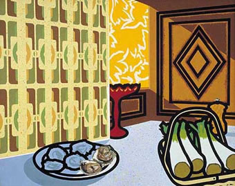 Autumn fashion 1978 (www.liverpoolmuseums.org.uk)
The bright lights of the big city
When I was art school in the ’80’s, I was always ambivolent about Caulfield’s paintings. Something in me made me want to like them, but they didn’t enagage me in the same way that the work of British artist Peter Blake, or American artists Jasper Johns, Robert Rauschenberg or Roy Lichtenstein engaged. But now looking back at a little of Caulfield’s work since the news of his death, something new now appeals to me about his painting, his Britishness.
From an early age, I was drawn (no pun intended) to the graphic styles and themes of American pop art like the bright lights of the big city. Never particularly inspired by the ancient faces staring down from the walls of the National Portrait Gallery or the landscapes of the National, pop was instant artistic gratification. From Warhol’s reproductions of print and packaging to the sculptural anarchism of Claes Oldenburg, the strong shapes and bold themes inspire me even today. It was only much later that I discovered the subtle nuances of the British pop art movement.
Peter Blake
While sharing many of the themes and techniques with their American counterparts, British pop artists remained distinctly eccentric. No more so than in the work of my favourite British artist Sir Peter Blake. Blake has become one of the best known British pop artists, making paintings and paint/collages which contain imagery from many contemporary references. But far from limiting his references to the contemporary culture, Blake combined images from pop with fine art.
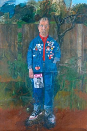 Self-Portrait with Badges 1961
Wheras much American pop art involves the small made large, Blake’s work often involves the collection and collaging of many tiny elements into a work of almost unimaginable detail. A compulsive collector and hoarder, Blake’s pieces are full to the brim in a joyous celebration of the everyday.
 Sgt. Pepper’s Lonely Hearts Club Band 1967
Perhaps best known for his work on the Beatles’ Sgt. Pepper’s Lonely Hearts Club Band album cover, Blake, now into his 70’s, continues to combine the old and the new in a new series of paintings featuring portraits of Marcel Duchamp alongside comtemporary British artists Damien Hurst and Tracey Emin. (His new work will be on display at the Waddington Galleries in Cork Street, London from 19th October.)
Look out Johnny Foreigner
Back in May, I hoped that British web designers can escape from under the smothering influences of American flavoured globalised design
and many of the replies contained the theme that, as Jon Hicks articulated, I don’t think that there is such a thing as British looking design.
However looking at the diverse work of distinctly British artists such as Patrick Caulfield and Peter Blake, I would argue that it is their approach, their influences and their cultural surroundings which have made them both quintessentially British and distinctive from their American peers. While both were clearly in step with the work of American artists of their generation, neither succumbed to pale imitation of work from across the Atlantic.
We can do the same with our designs for the web.
podSite available
This editorial is also available as a podSite for offline reading on your iPod. Download this podSite (4Kb txt format).
Replies
-
#1 On October 2, 2005 10:52 PM Matt Wilcox said:
To my mind many people mistake ’individuality’ and ’integration’ as being mutually exclusive. I see no reason why national pride and culture (an individuality of sorts) can not happen within a ’multi-cultural’ soiciety (global scope), and i see no reason why this can’t be expressed through design on the web.
I’d have to disagree with Hick’s oppinion and argue that there is a type of British Design; it’s design that takes inspiration from almost everywhere, especially old colonial outposts. It’s design that doesn’t hold itself to one style or genre, and in doing so it becomes a genre. British design often, to my mind, has a bredth and depth which is recognisable, but distinctive. It borrows from other cultures and expresses them through it’s own British interpritation. It often doesn’t copy wholesale, it doesn’t imitate, it ’compiles’. Which is what the British as a people and a culture have always done.
-
#2 On October 3, 2005 11:31 AM Jon Hicks said:
Matt - I agree with you, but my point was that I don’t think you can look at a design and be able to say "Thats British" in the way that you can look at a site and know immediately "Thats American". Unless you’re being blatantly obvious - using things like Union Jacks etc. I think ’British Style’ is actually more European/Scandinavian.
How about some examples of ’British Design?’ Looking at the featured designs in https://www.best-of-british.com/, I couldn’t look atany of those and be sure that thay came from the UK (just by looking at the style)
-
#3 On October 3, 2005 03:55 PM Matt Wilcox said:
Fair play, I’d agree that I couldn’t be certain which designs were British and which were not. On the other hand I would not say I’ve noticed an obvious American style of web design either. The identifiabliity of American sites, to me, is much more down to the language used than the design itself.
-
#4 On October 3, 2005 05:00 PM Jon Hicks said:
You can make some generalisations. A lot of American designs favour serifs and slab serifs, whereby Europeans are more likely to use San-serifs. Also, colour palettes are often distinctive - warmer browner colours, whereas ours are colder? The typography style is the one that I tend to notice though.
The use of language is certainly a give-away, but would we include the use of language as part of the design? Or is that really the content? I don’t know, I’m just raising the question!
-
#5 On October 3, 2005 09:53 PM Jon Hicks said:
With language we have 2 types - the written and the visual. I’m assuming that everyone is talking about the former, but Andy’s premise seems to be talking specifically about the design (or ’look’) of the site.
I think if we’re moving into the realm of art, then we’re dealing with a very different kettle of fish. I think there is more to go on here, and cultural identities are much stronger.
Maybe the reason why I find it hard to tell ’British design’ is because no one has gone out of their way to do one? Perhaps if more designers took up the call that Andy is shouting, then I would be able to tell?
Fascinating stuff this.
-
#6 On October 4, 2005 01:45 PM Matt Wilcox said:
OK that is it. My future designs shall come with top-hats in the header area, and red telephone boxes containing a blue-helmeted British Bobby in the footer. Designs will also include the welcome text ’what-ho chaps’, and the fairwell ’toodle-oo!’.
On a more serious note; could it be that it’s harder to pick out designs from the environment with which you have grown up? Designs that are striking, and recognisable, tend to be ones that are different from the norm. If your norm is British design, maybe you become more aware of the faculties of other design traits, and less so of British design?
-
#7 On October 6, 2005 12:53 AM goodwitch said:
Ooooo, Molly, what a pretty word picture about the Aborigine in full tribal dress and the Aussie of European decent. I love the concept of being true to my culture(s) and my individual uniqueness, while being open to (and delighted by) others who are different.
This reminds me of your post on blogging with courage. When I read Andy’s post about British Design, it was like a wake up call to encourage distinctive design. Be bold, be brave. And while vanilla can be a perfectly good flavor, don’t choose plain vanilla unless that is what really compliments the content/functionality.
(sidenote: damn, I just realized a podsite isn’t a podcast. i can already access rss feeds on my pda. i thought i was gonna get to hear andy read a story!)